-
Context
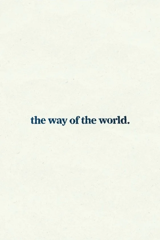
The Way of the World is a 30-60 second animated short built around a reading of a Mary Oliver poem. The assignment was to choose a piece of spoken audio and bring it to life. This poem feels plainspoken and clear, but also mysterious. Like something you almost miss if you’re not paying attention. I wanted to hold onto that tone. Steady, grounded, and quietly moving.
Challenge
The poem isn’t dramatic. It doesn’t build to a big reveal. It just notices things. And that’s what made it hard. The challenge was to create visuals that didn’t over-explain or distract, but instead matched the stillness and the slight strangeness of the words. I didn’t want the animation to feel too polished or digital. I wanted it to feel a little handmade, a little human.
Solution
I worked with a slower frame rate and inky, minimal textures to create a sense of pause and presence. The movements are subtle and imperfect, like a drawing that keeps breathing. The color palette is restrained. The rhythm is soft. All of it was meant to echo the poem’s voice, just noticing the way things are. In the end, it’s not about telling a story. It’s about creating a feeling you can sit with for a second, before moving on.
-
Visuals
The visuals in The Way of the World are all about feeling. Wet, inky strokes move across off-white paper textures, giving the piece a quiet, lived-in look. The type is simple and steady, letting the words breathe without getting in the way. Nothing shouts. Everything works together to hold the mood. The slower frame rate keeps it from feeling too smooth or polished. It stays a little raw on purpose, like a thought just forming.
-
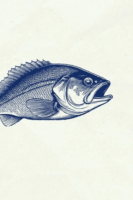
Illustration
The illustration style draws from linocut techniques, with rough textures and bold, carved lines that bring weight and simplicity. A fish illustration was created using AI to capture this look within a limited timeframe. The linocut approach fits the tone of the piece, creating an honest, tactile, and a little imperfect feeling, echoing the grounded and matter-of-fact voice of the poem. The visual texture adds depth without overpowering, giving the words space to resonate.
-
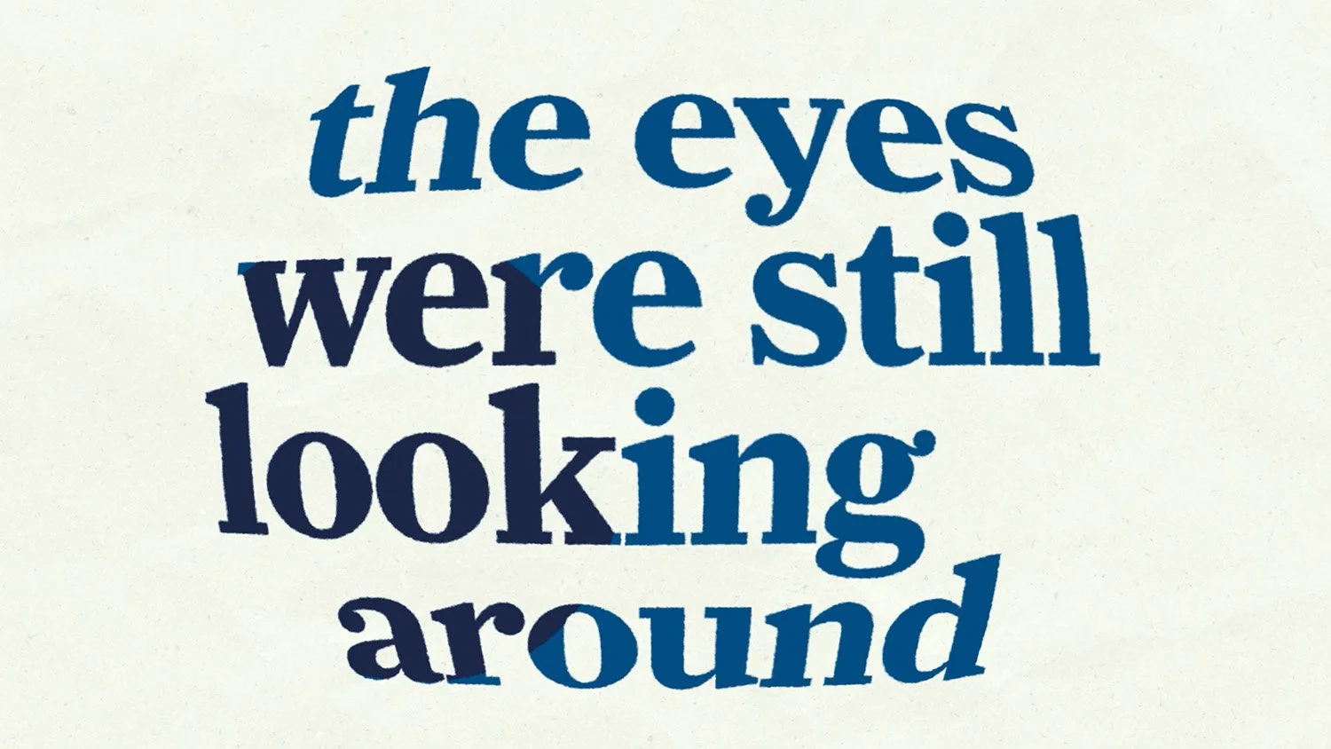
Typography
The typography moves gently, keeping time with the voice. Nothing rushes. Words arrive with a kind of care, then settle into place. Some moments hold still. Others shift just enough to be felt. The goal was to keep it simple and honest. Not to show off, but to listen. The motion helps the language land, giving it weight without getting in the way. It’s not about doing more. It’s about knowing when to stop.
course
Kinetic Typography
instructor
Courtney Windham
completed
Fall 2024
recognition
Kaleidoscope Student Show Spring 2025