-
Context
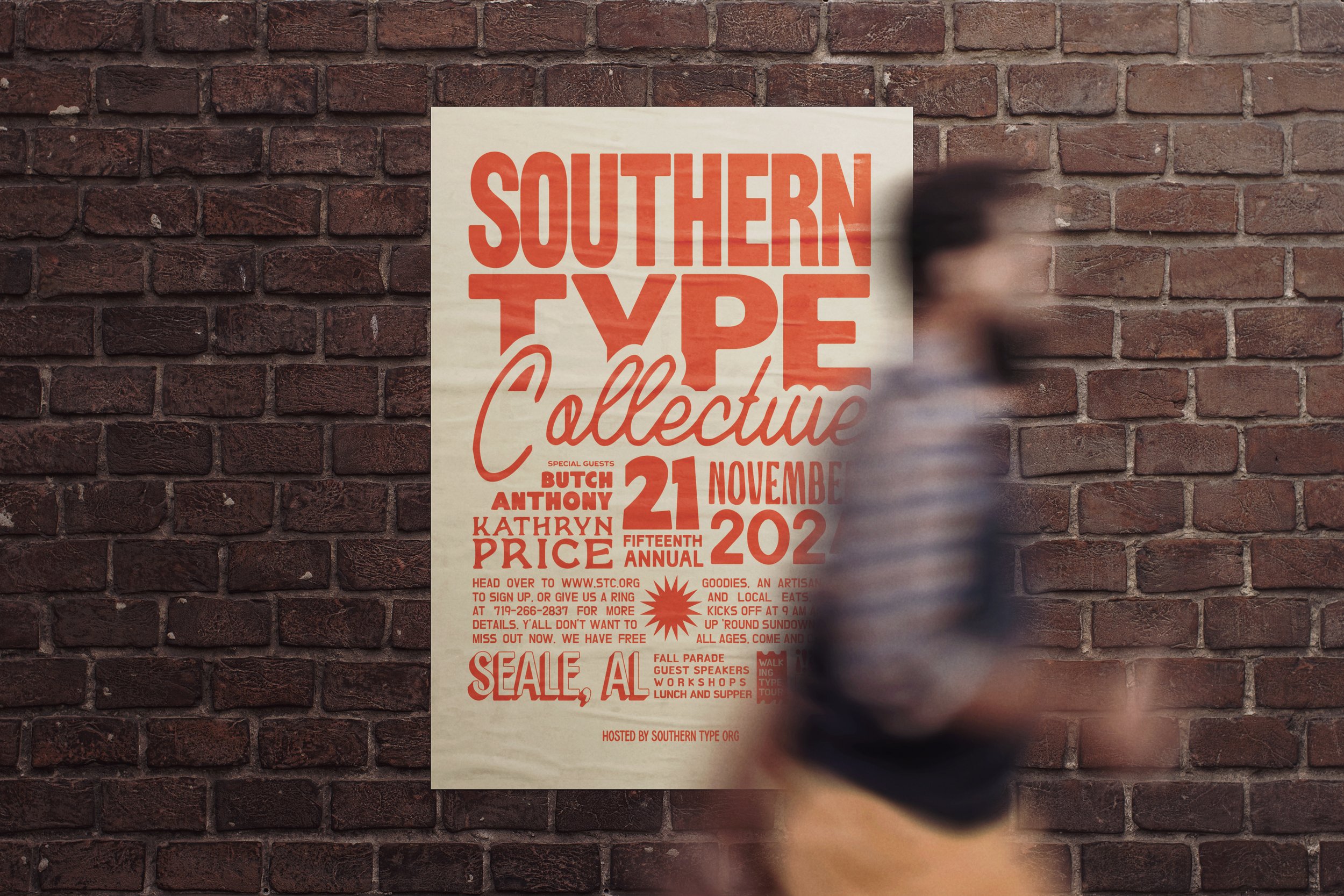
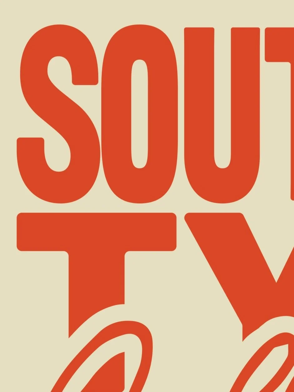
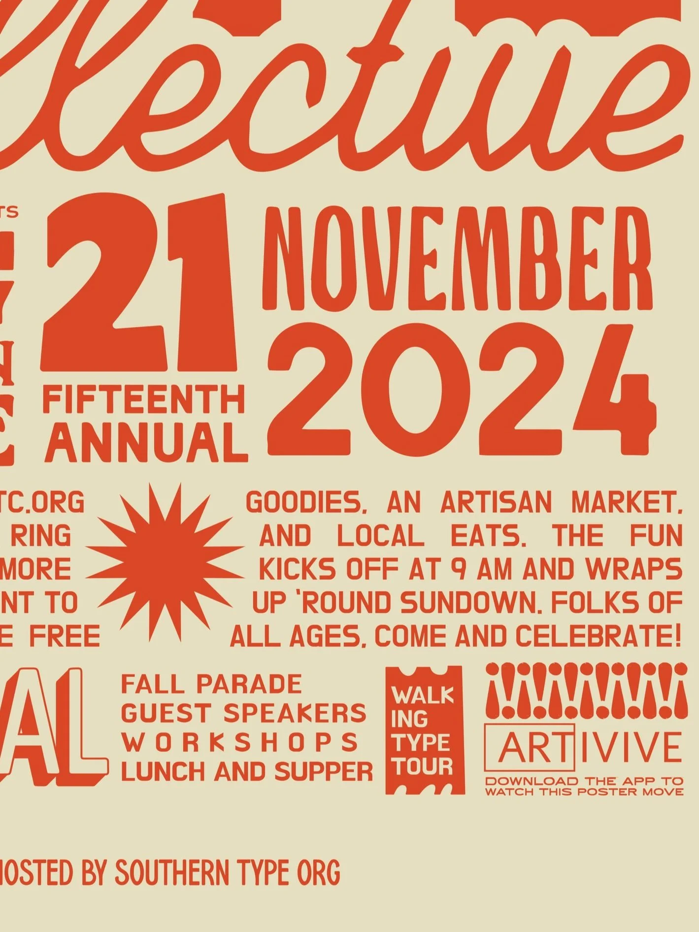
Southern Type Collective is a homegrown celebration of everything handmade and hand-lettered, spotlighting typography that feels alive and a little rough around the edges. Hosted in Alabama, the tour and festival bring together artists, designers, and anyone with a soft spot for a good ampersand. The poster sets the tone with warmth, grit, and just the right amount of attitude.
Challenge
The heart of the festival is its love for the tactile and analog. The challenge was to create a poster that held onto that handcrafted feeling but still offered something unexpected. It needed to live on a wall and then surprise you when it came to life in your hands.
Solution
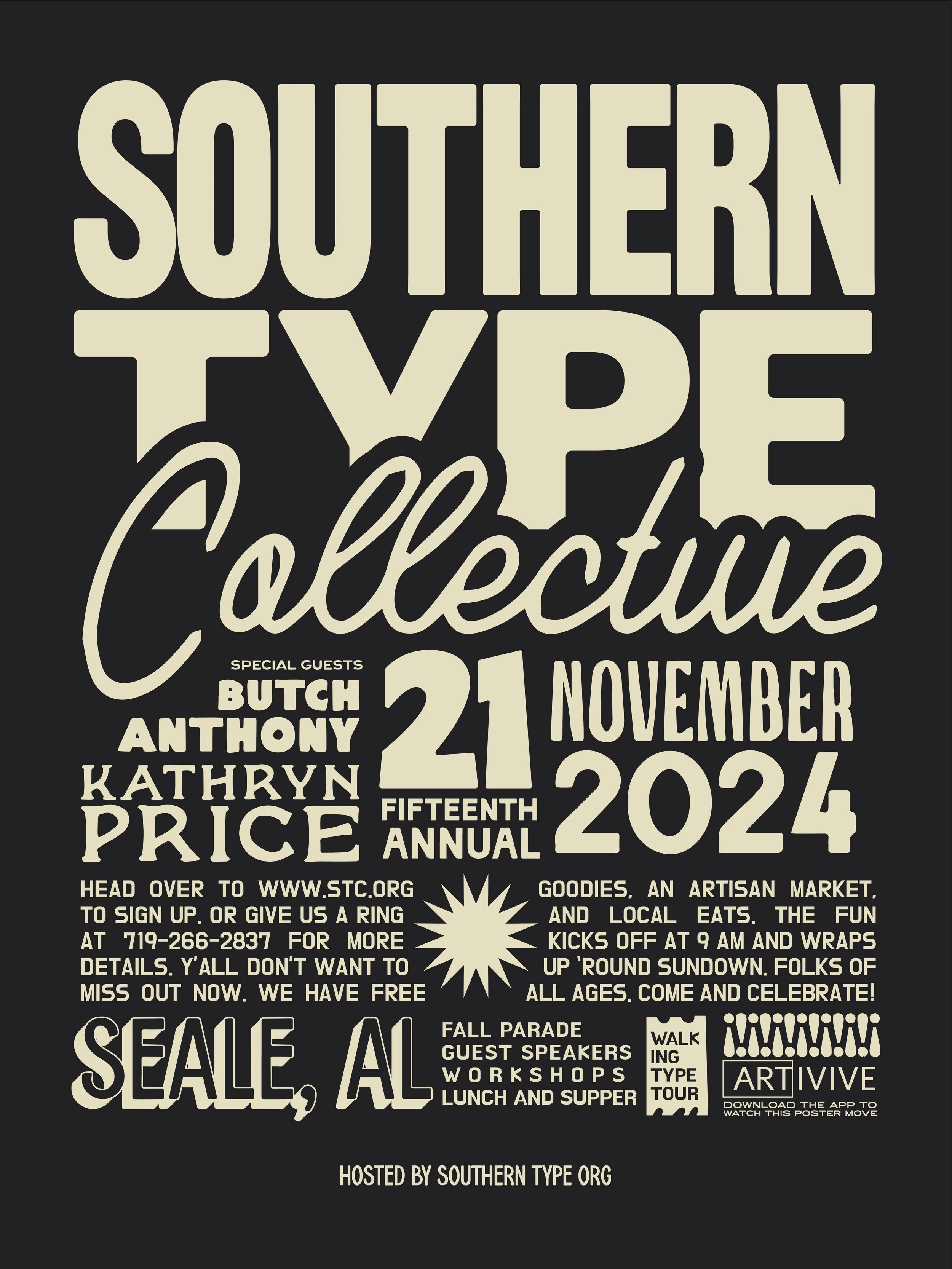
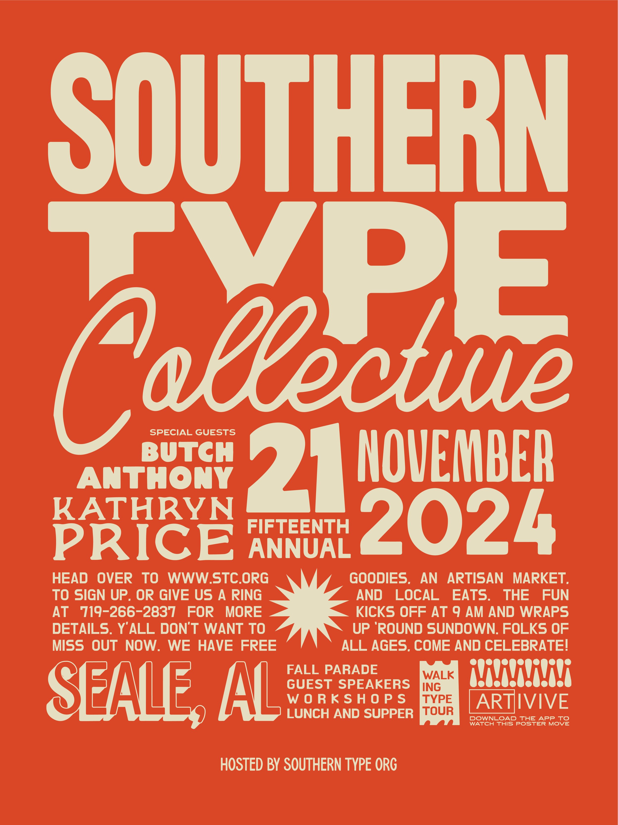
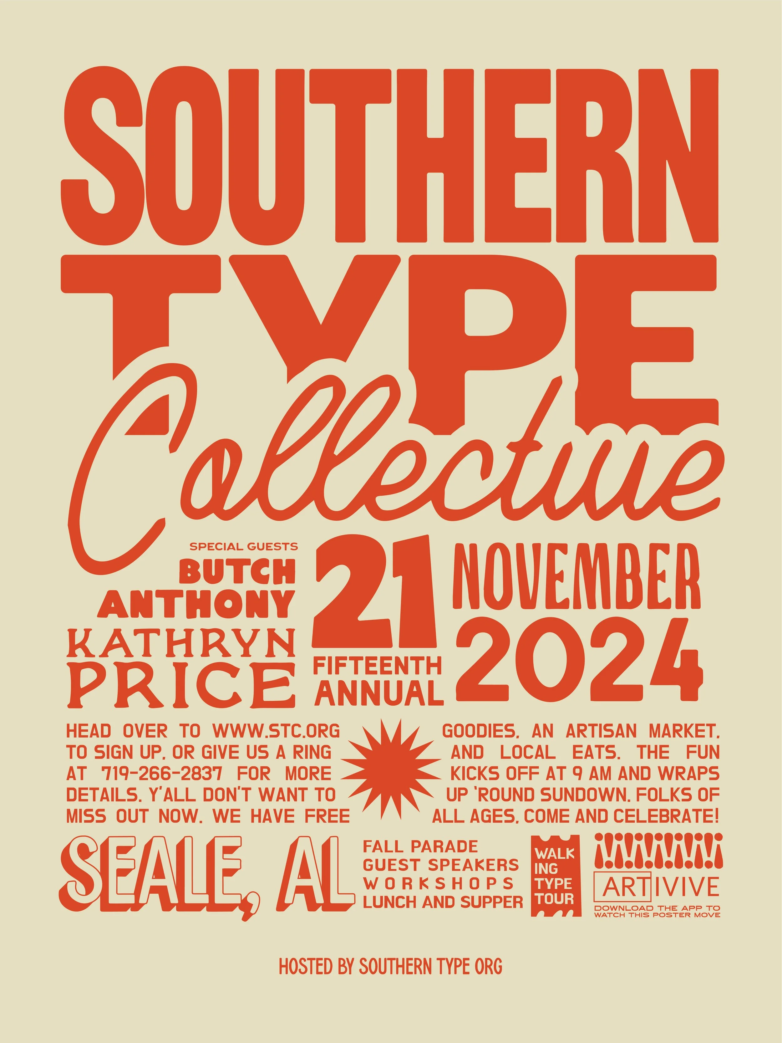
A bold, type-filled layout pulls from vintage signage, screen-printed posters, and roadside lettering. Once scanned, the poster turns into a moving piece on your phone, where letters animate and shift without losing their charm. It’s a moment that blends old and new, staying true to the spirit of the South and the craft of good typography.
-
Color Scheme
The poster leans into a punchy orange and soft cream combo that feels equal parts retro and rooted. It pulls from old signage, vintage tees, and the kind of screen-printed posters you’d pin up and never take down.
-

Animation
Scan it and the whole thing starts to move. Letters shift, shapes pulse, and what was once still gets a little life breathed into it. It’s just the right kind of surprise for a festival built on creativity.
-
Typography
A medley of hand-drawn letterforms gives the poster its voice. From chunky slabs to curly scripts, every piece feels collected, not manufactured — like it was found on a road trip through the South and brought home to tell a story.
course
Graphic Design II
instructor
Courtney Windham
completed
Fall 2024
recognition
GLITCH AWARD Mississippi State University