-
Context
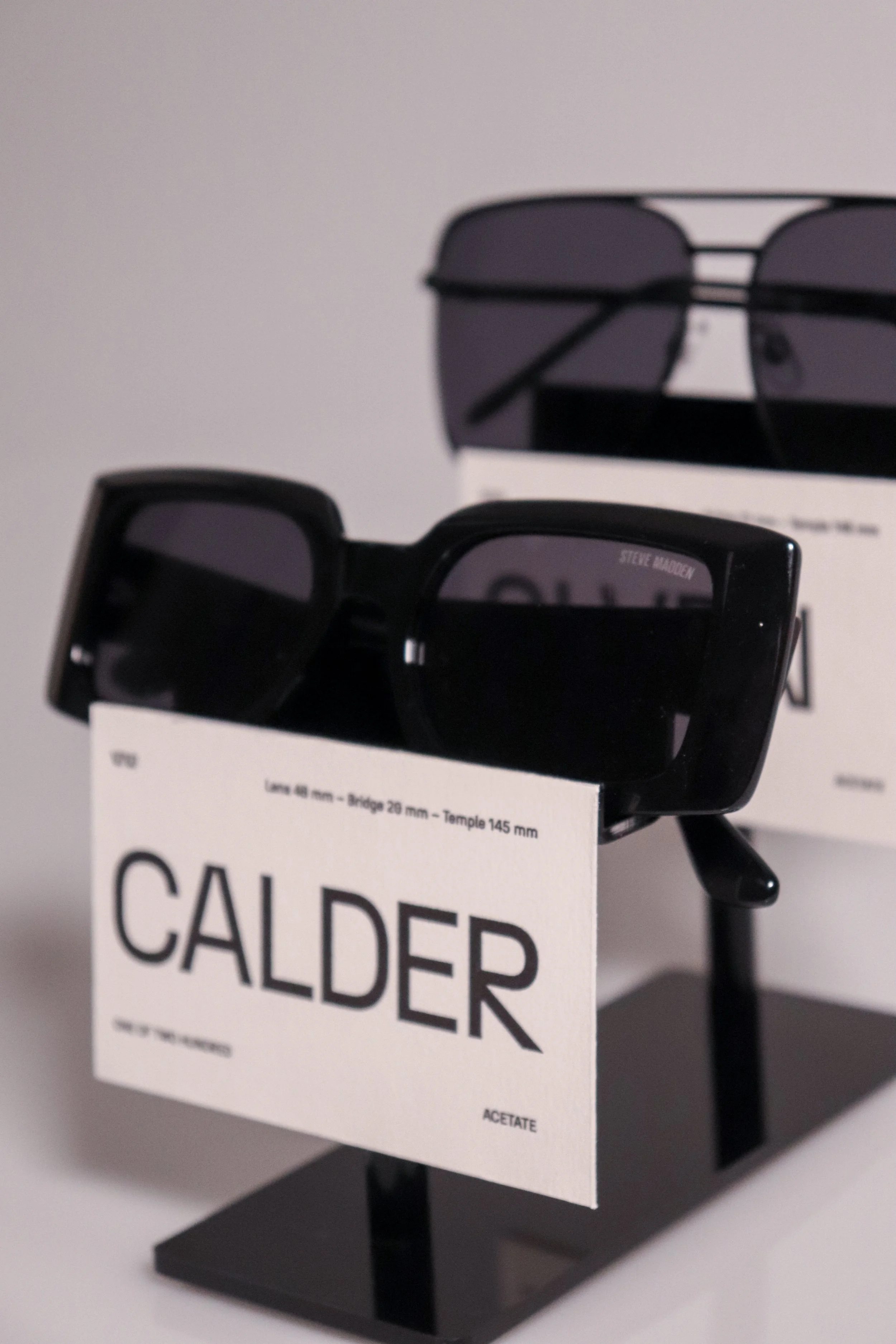
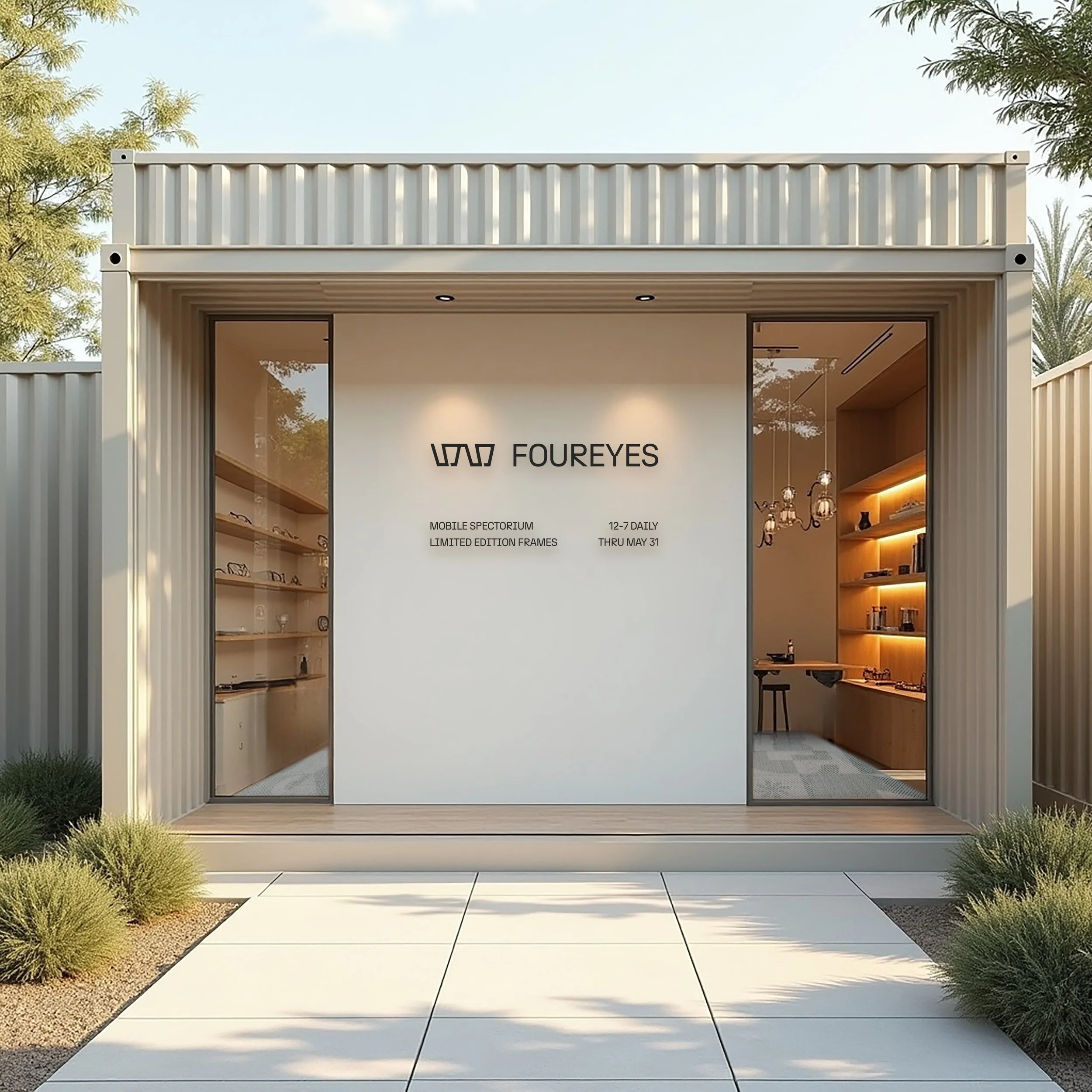
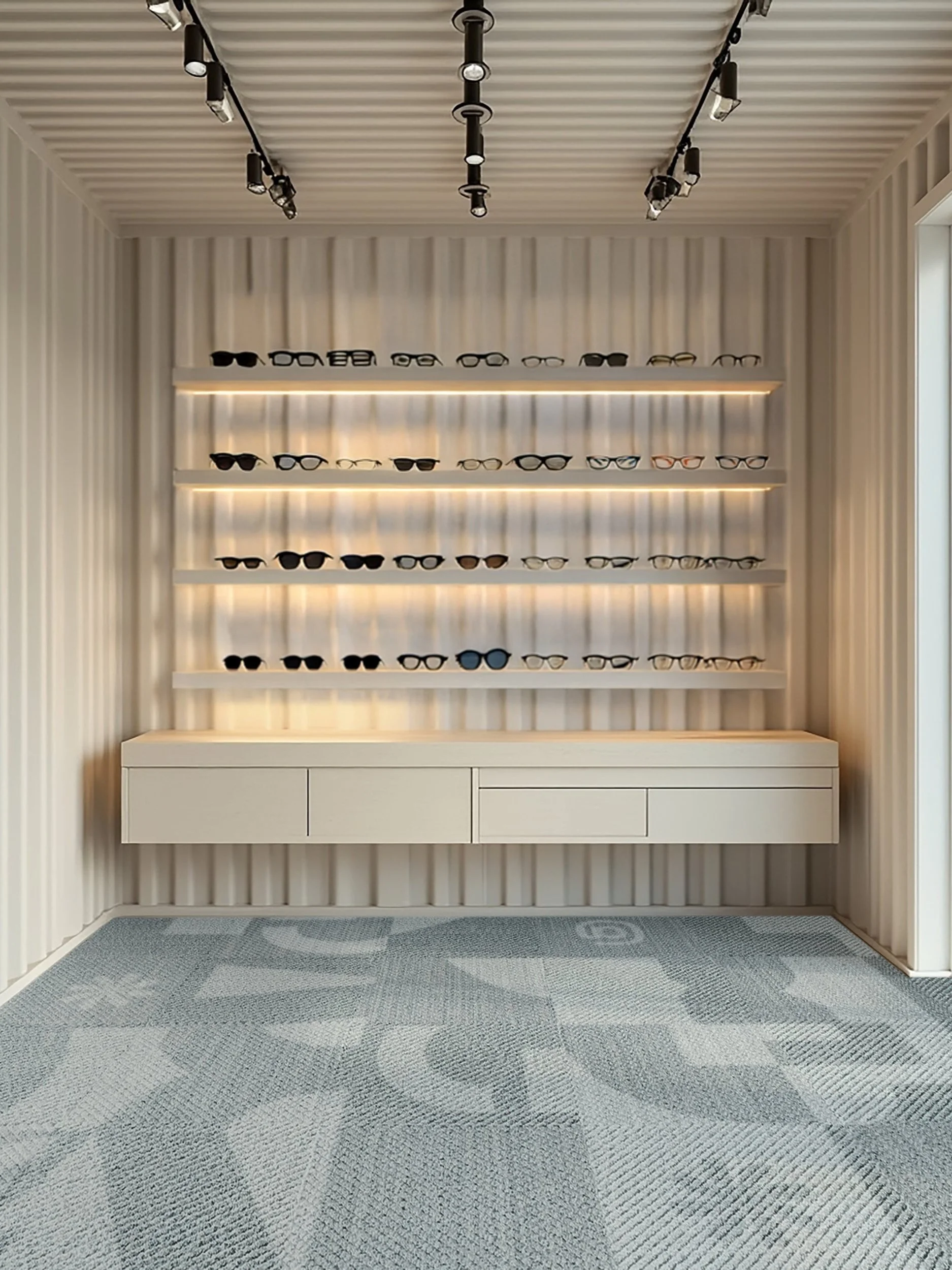
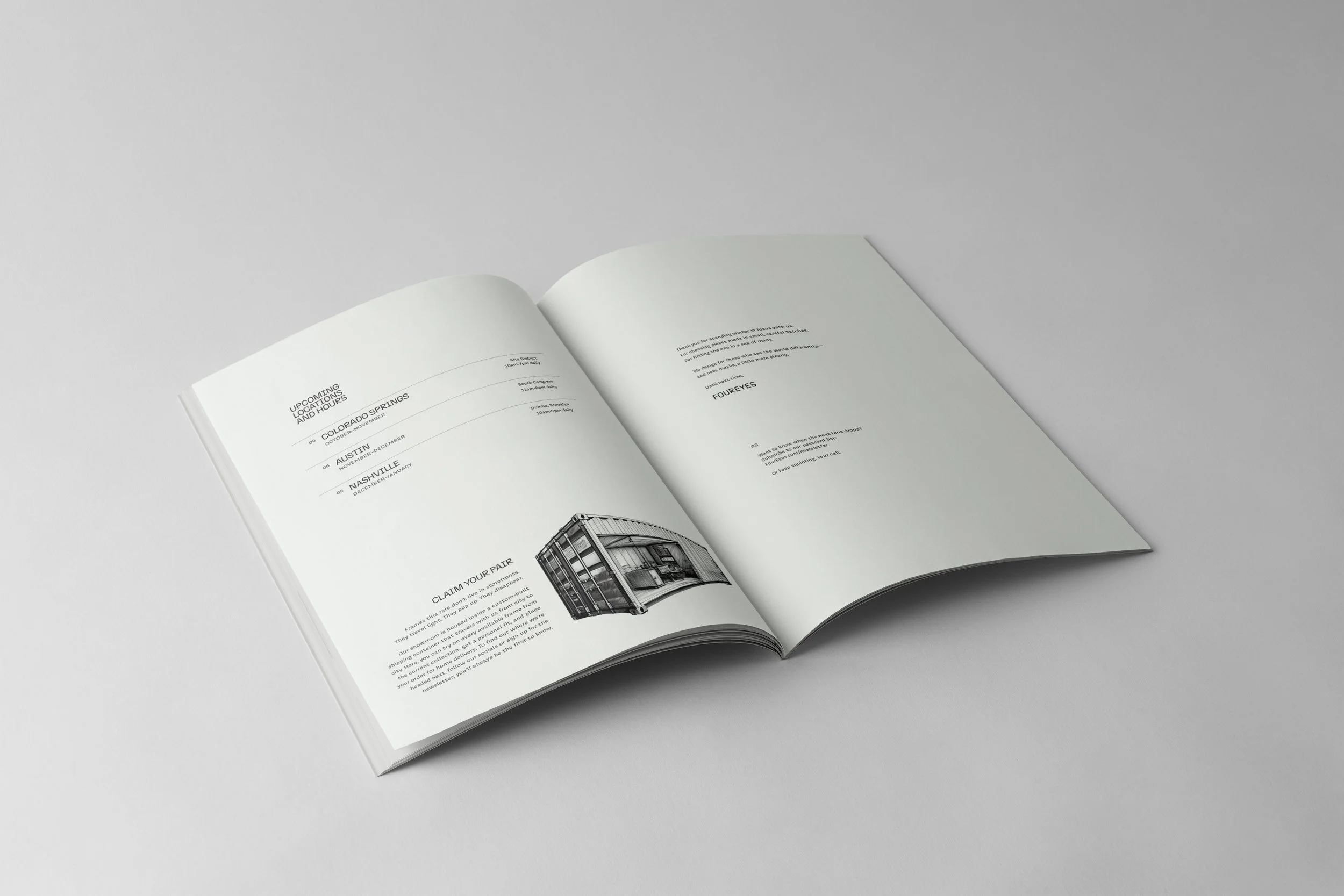
FOUR EYES is a traveling pop-up eyewear brand that believes finding the right pair of glasses should feel a little more like finding yourself. With limited-edition, retro-inspired frames and a visual world full of charm, it invites people to slow down, try things on, and look twice. The goal? To turn the often overwhelming task of choosing eyewear into something personal, expressive, and honestly, a bit more fun.
Challenge
In a world full of endless scrolling and same-same styles, FOUR EYES had a different idea. What if picking out glasses felt less like a transaction and more like a moment? The challenge was to build a brand that didn’t just show up in different cities, but showed up with personality, purpose, and a clear point of view. Something that felt intentional, thoughtful, and totally one-of-a-kind.
Solution
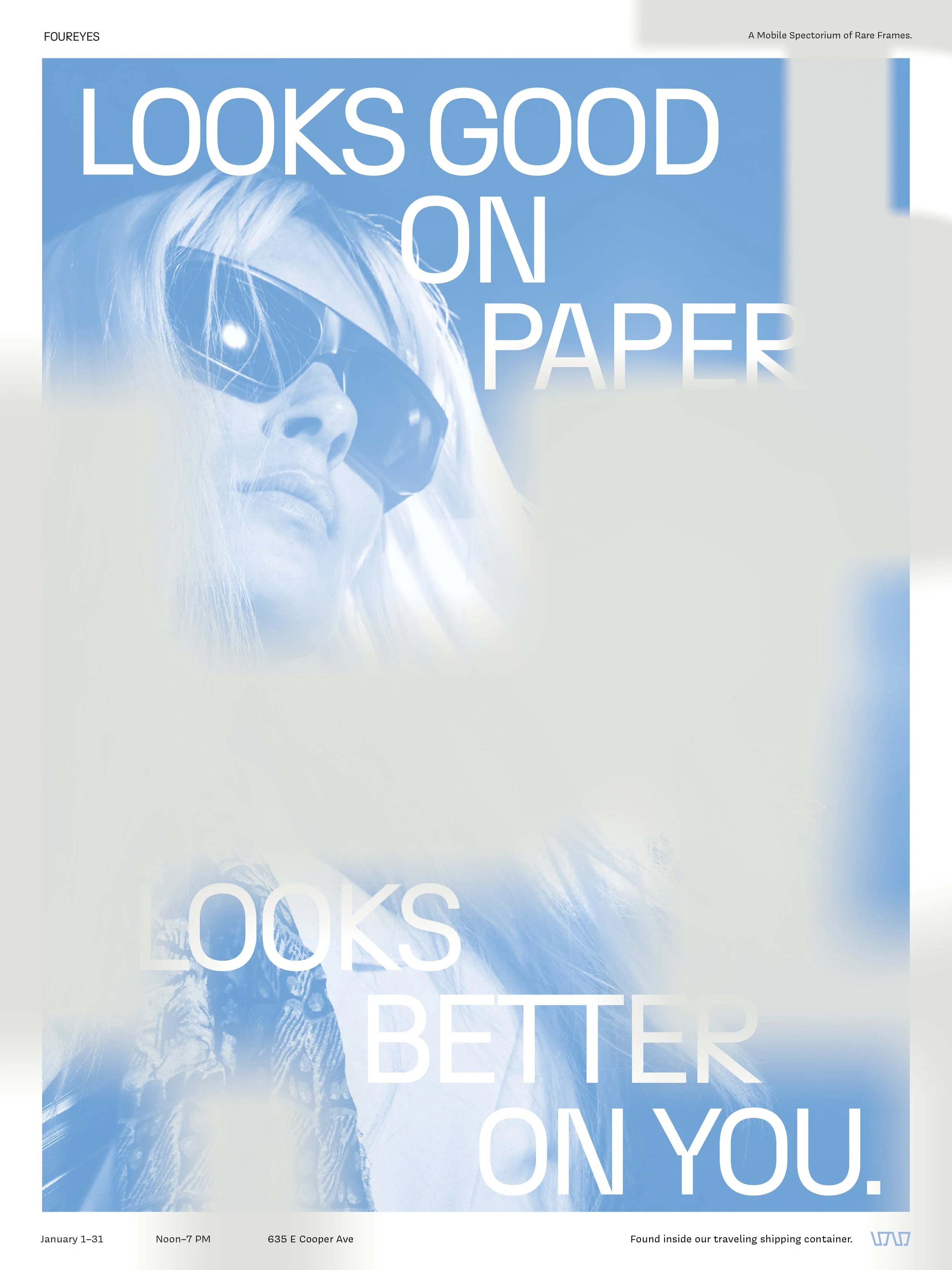
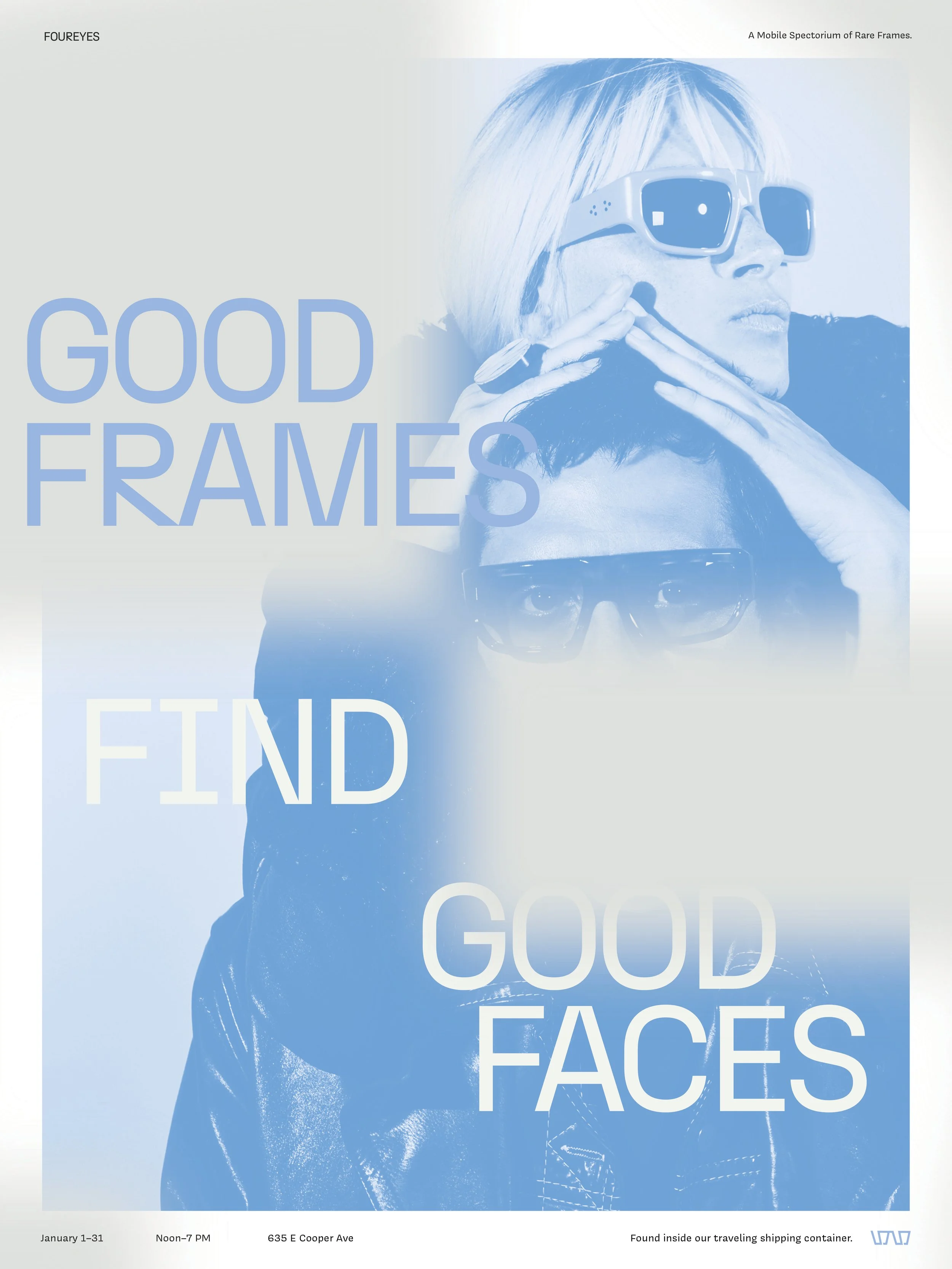
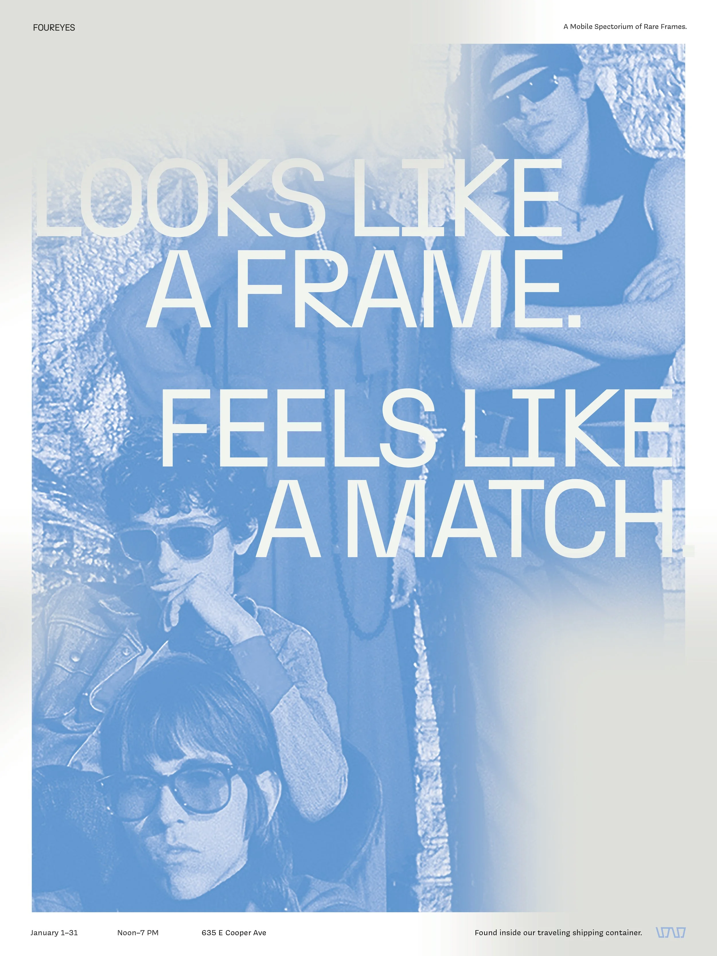
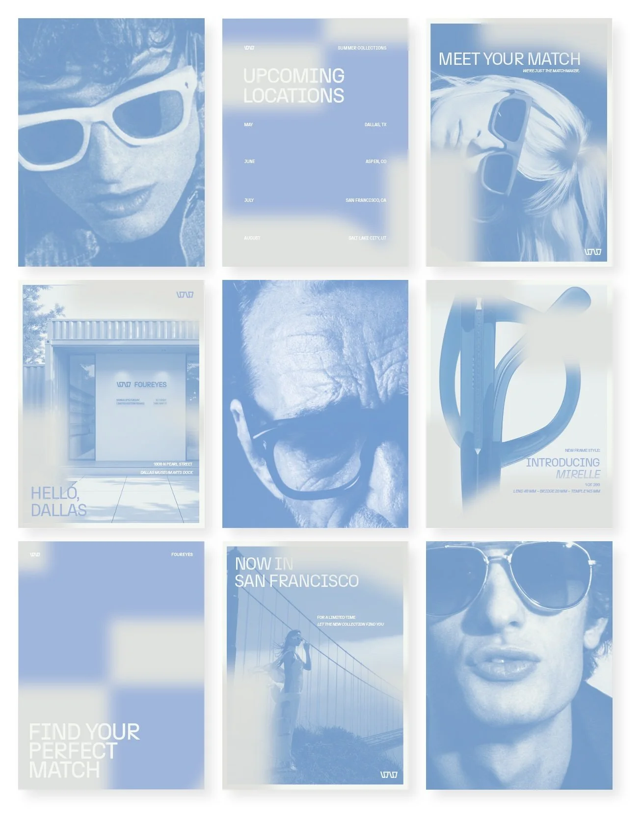
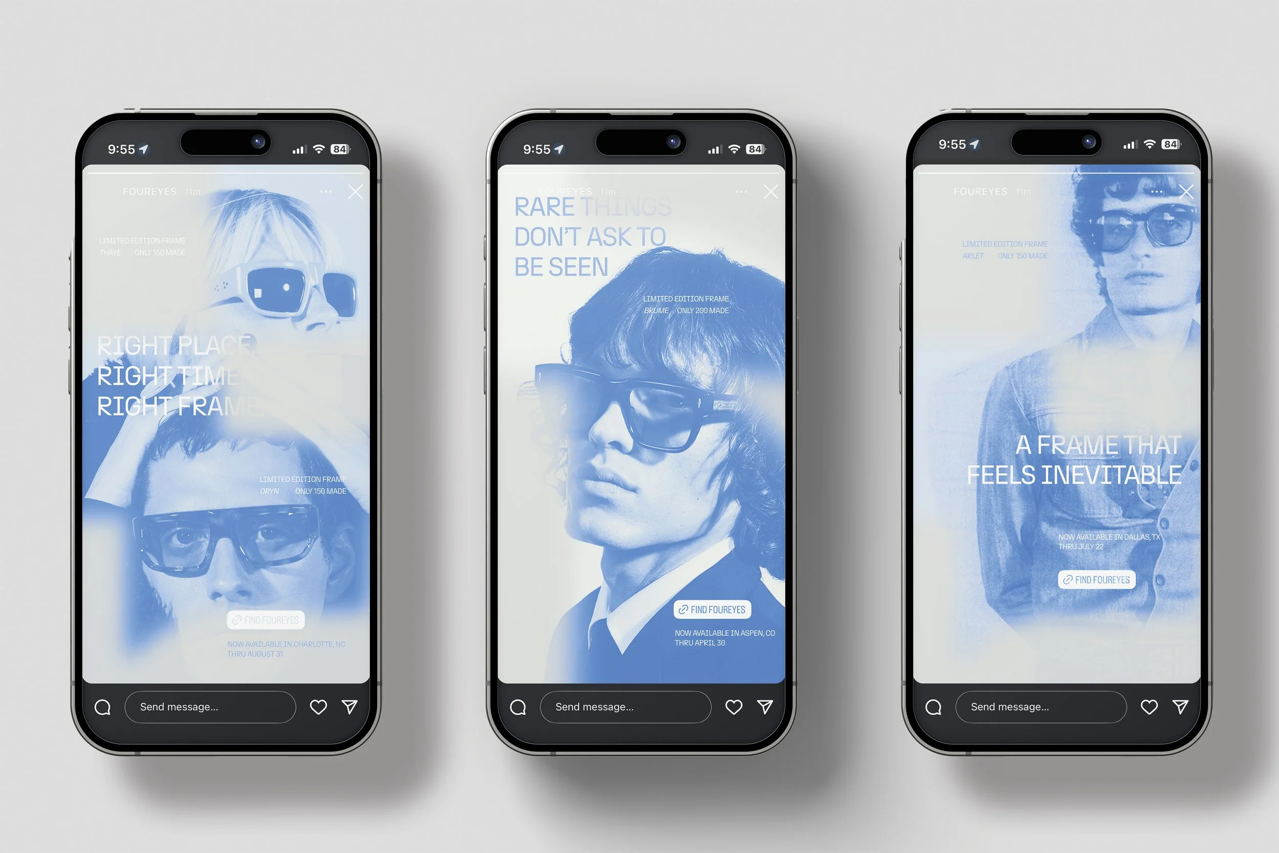
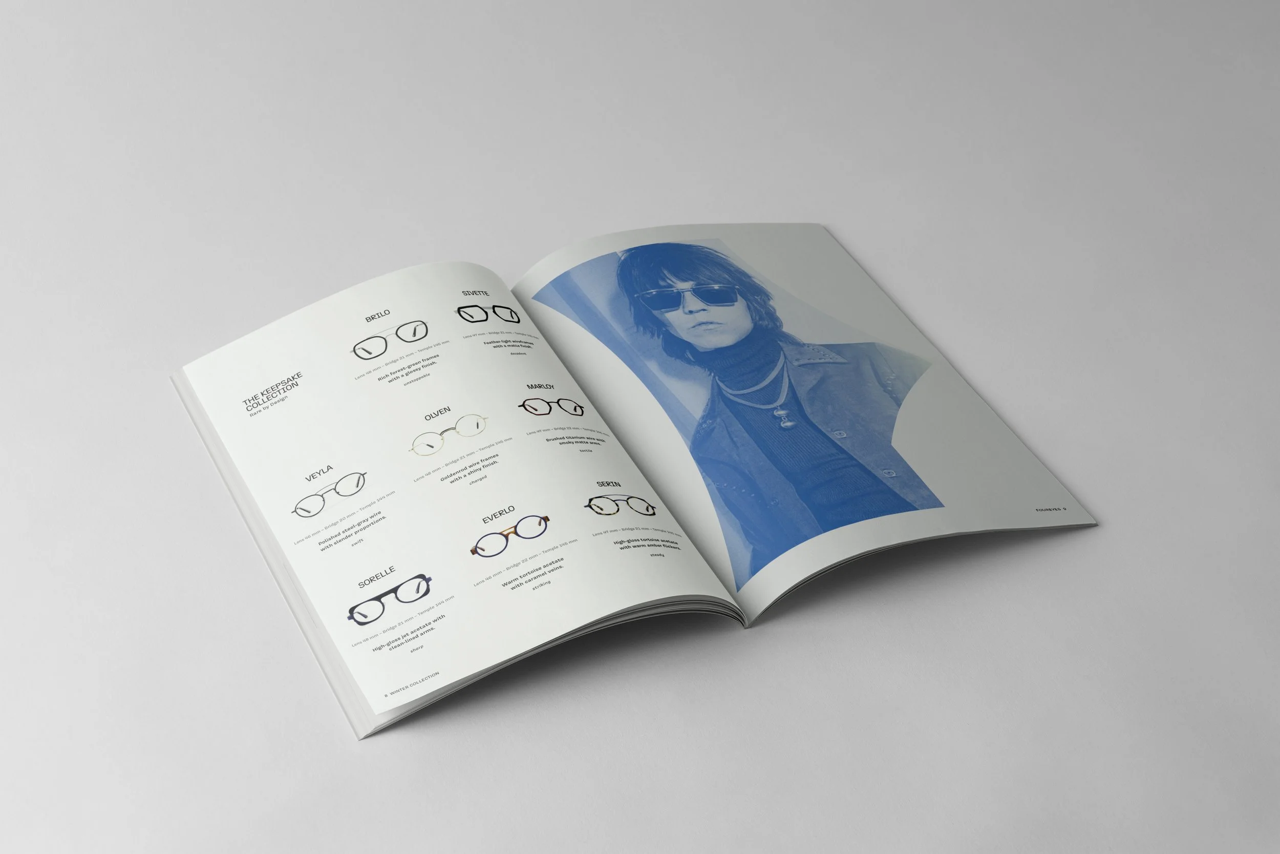
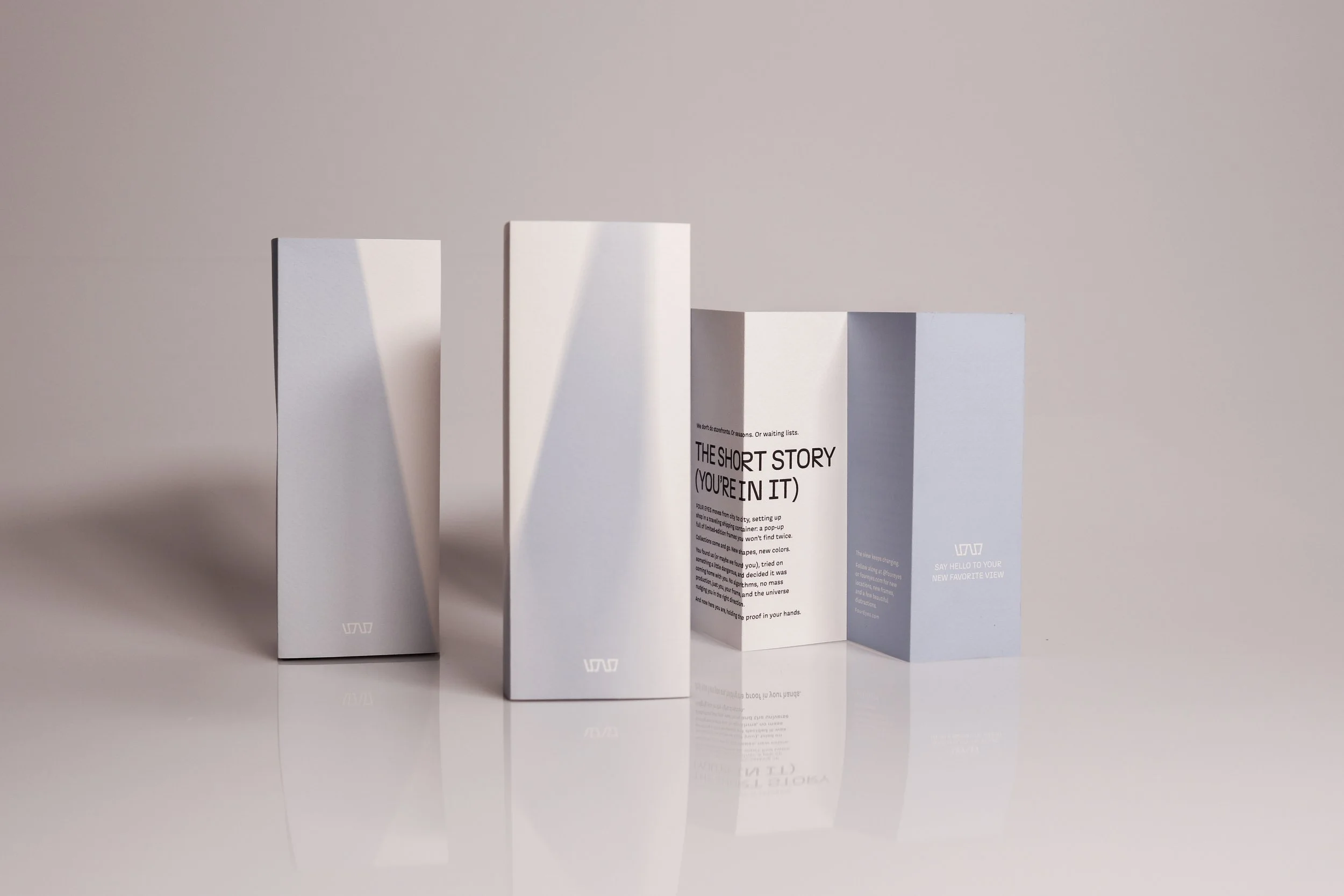
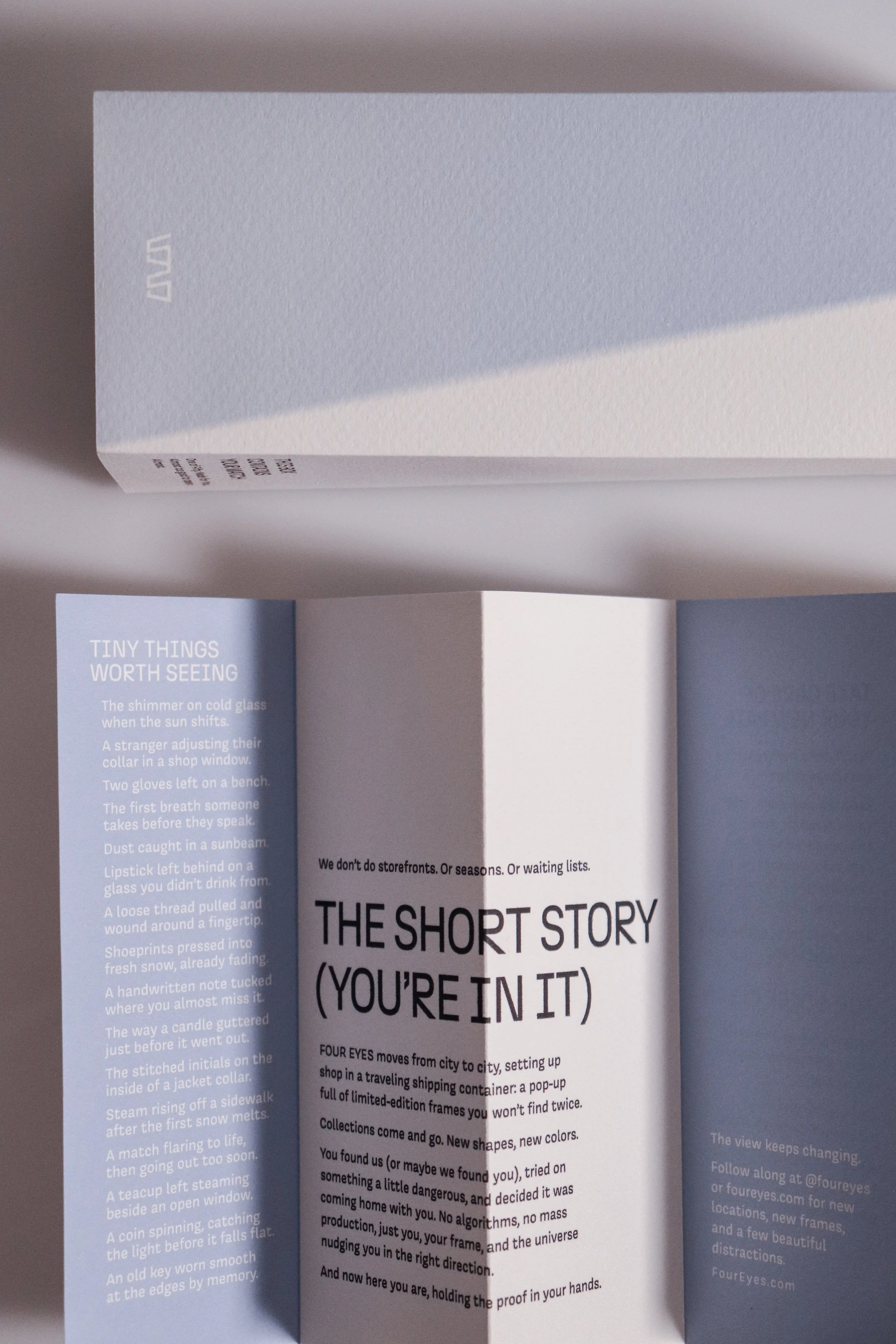
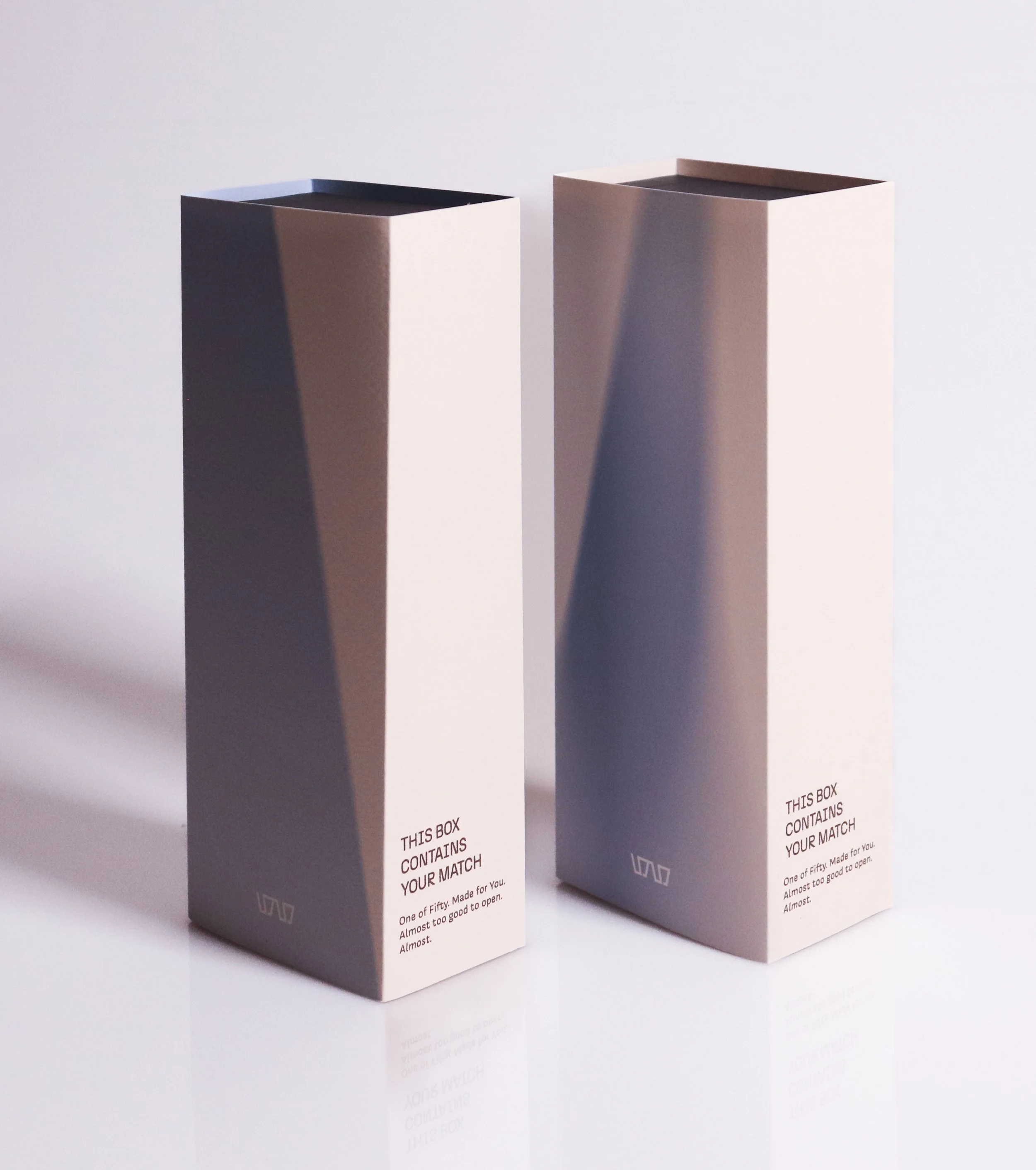
The brand identity leaned into cropped type, tactile textures, and a vintage-inspired color palette that feels like something you found in your cool aunt’s attic. Every detail—from the pattern made out of sliced-up letterforms to the way the space was designed to guide your eye—was about focus and discovery. FOUR EYES became less about selling frames and more about helping people find the one pair that actually felt like them. Not perfect, but perfectly theirs.


-

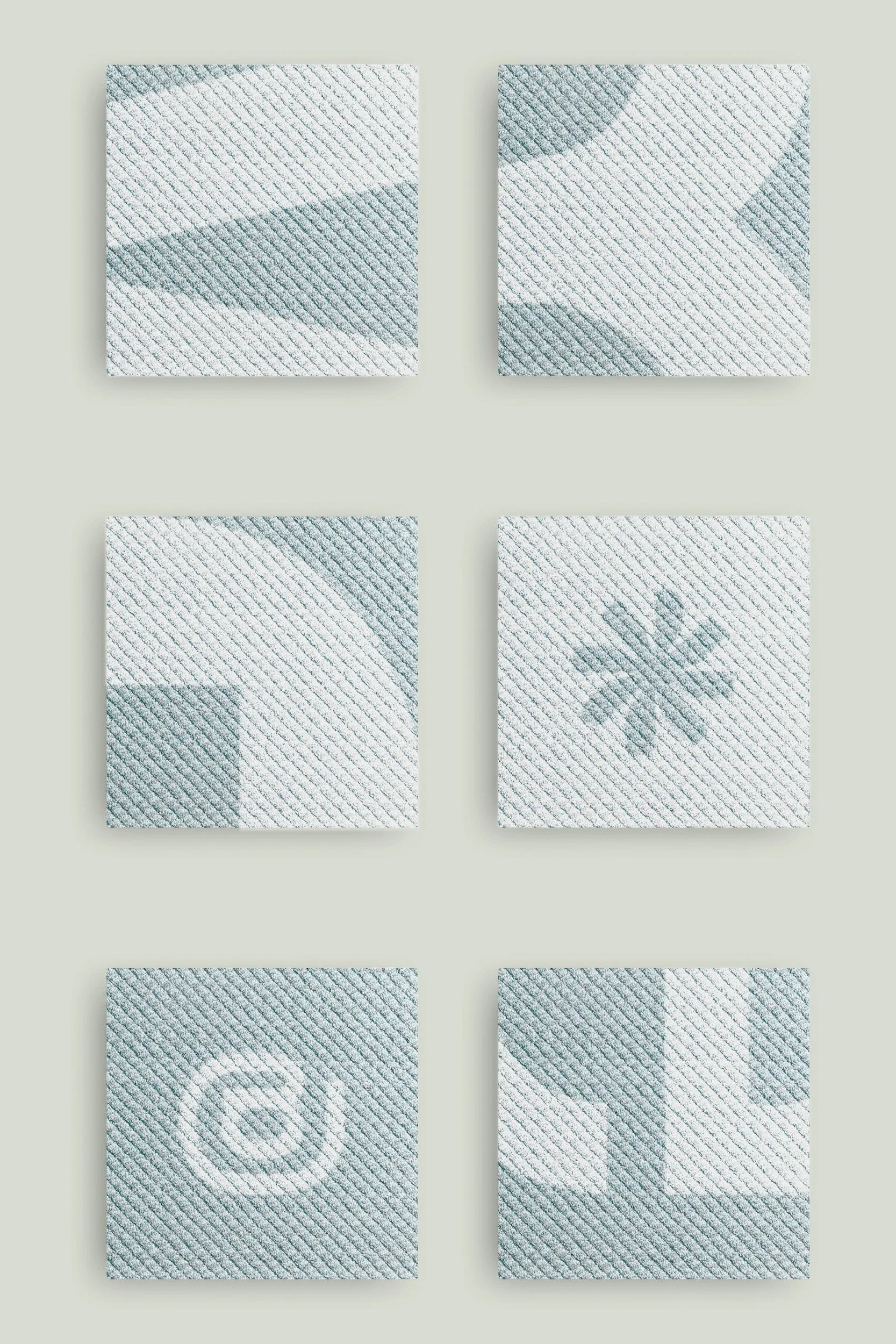
Brand Pattern
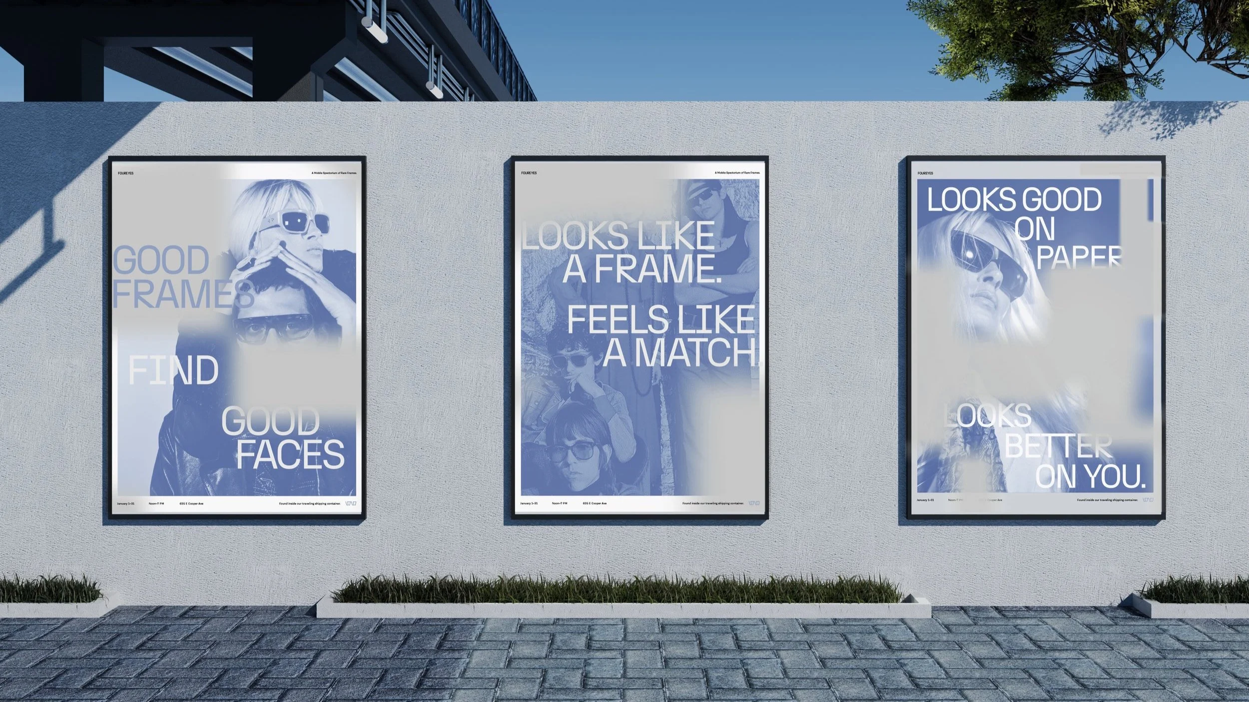
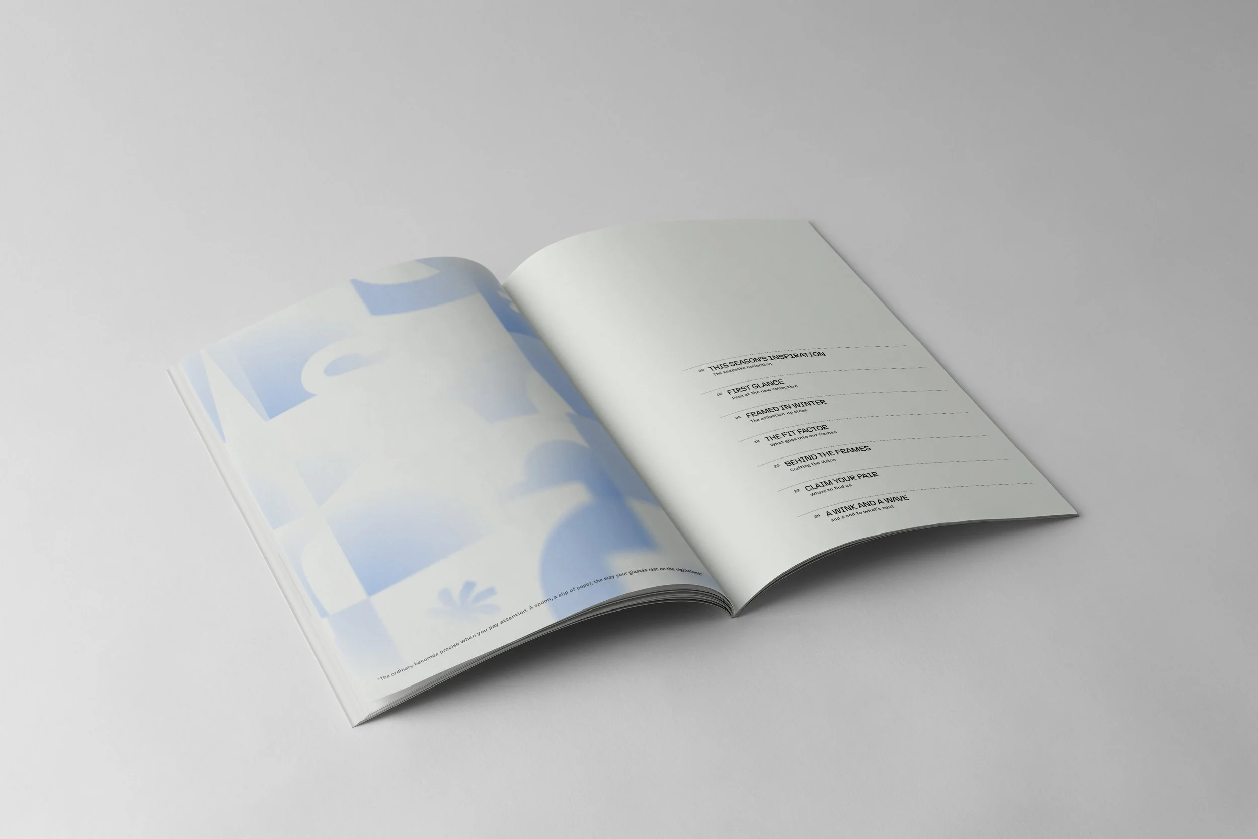
The brand pattern is made from sliced and abstracted angles of letterforms, turning typography into a graphic language of focus. It appears across carpet tiles and tissue paper, acting as both a design motif and a spatial guide.
-
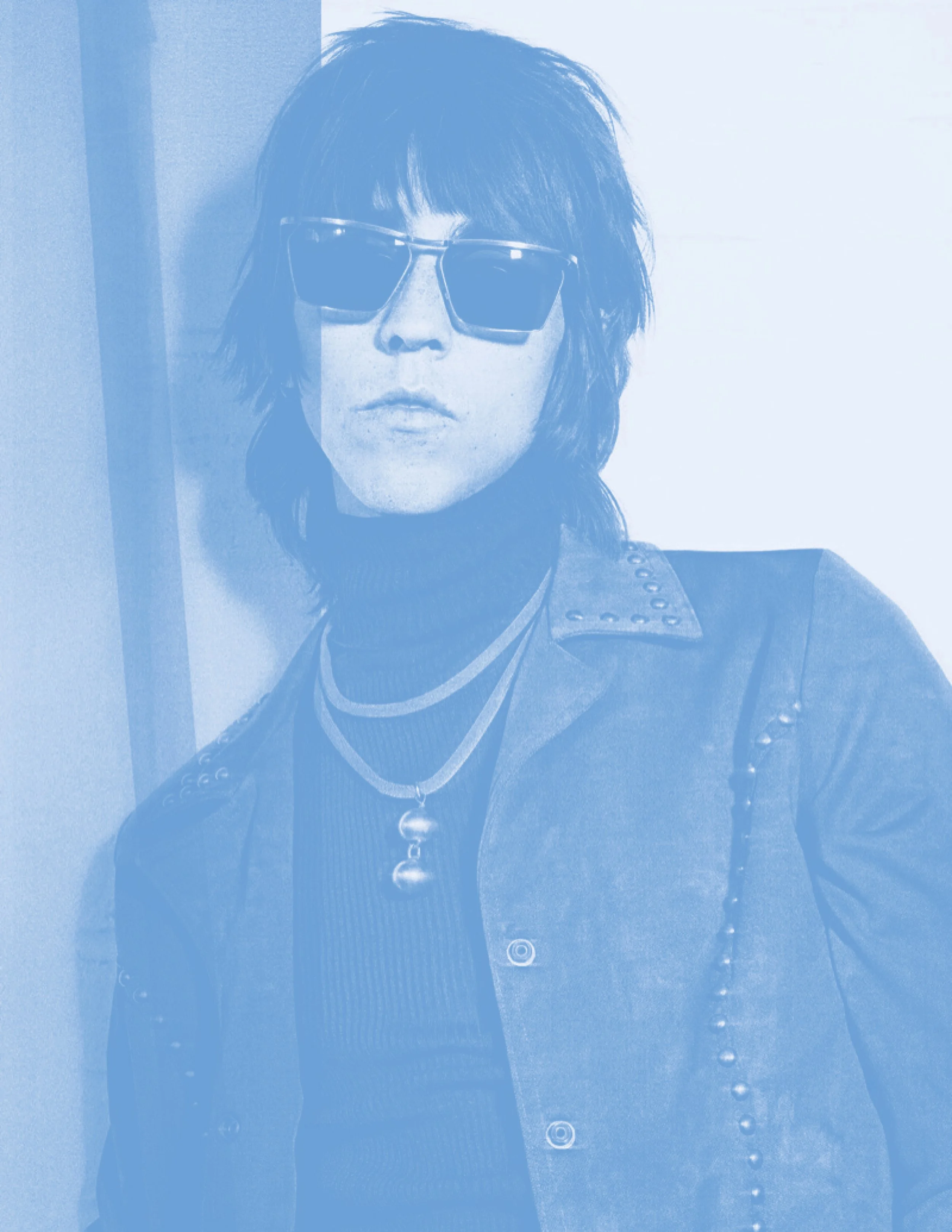
Image Treatment
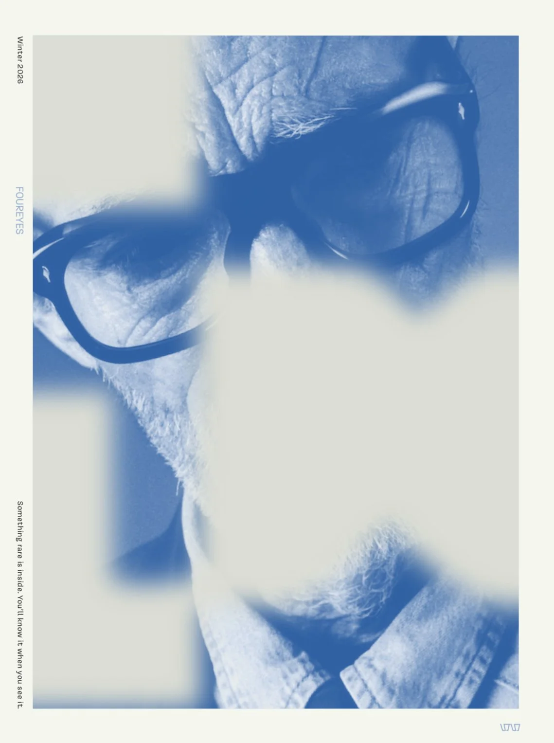
Black-and-white film photography was edited with soft duotone overlays to create a sense of intimacy and nostalgia. The treatment adds mood and cohesion, giving every image a timeless, cinematic quality.
-
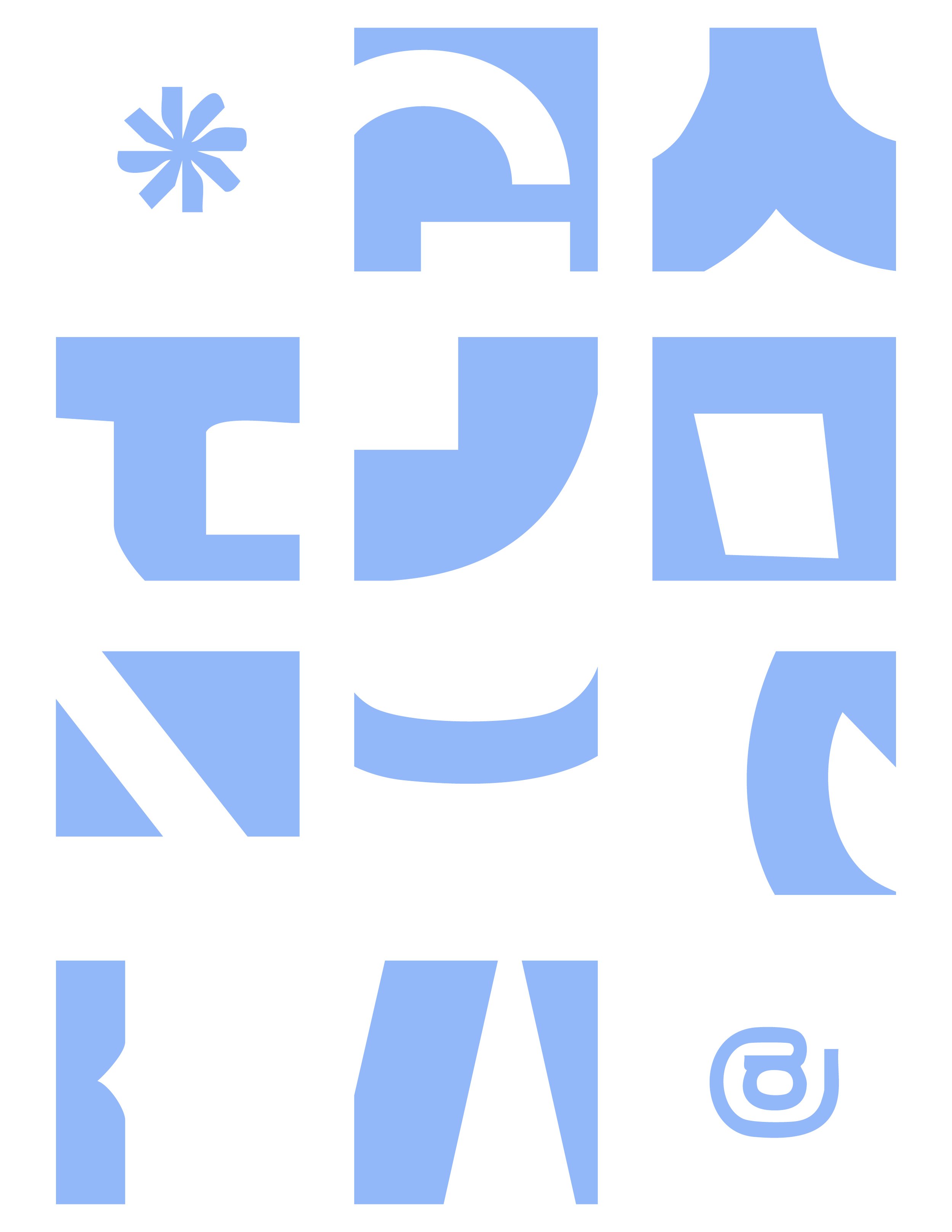
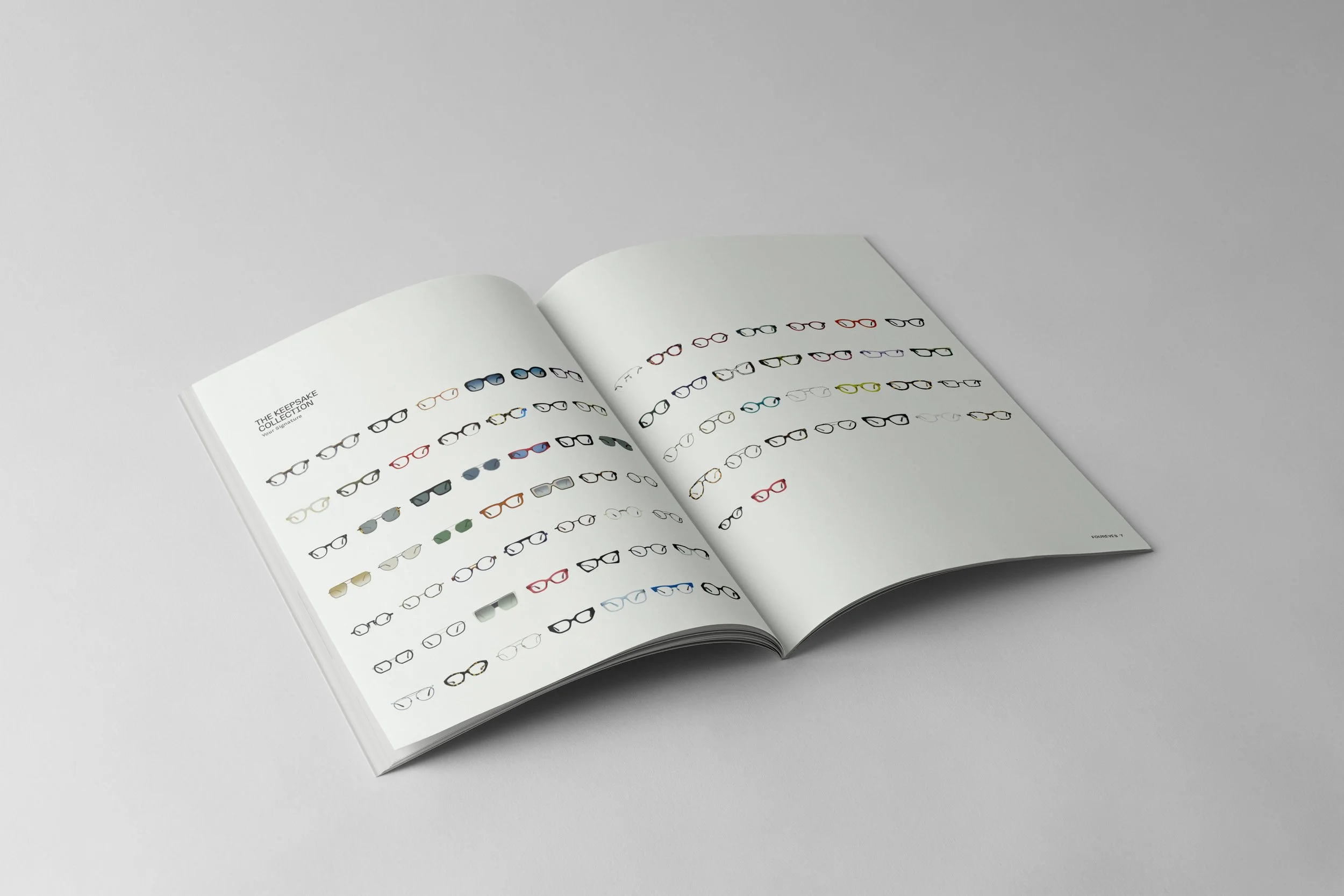
Graphic Assets
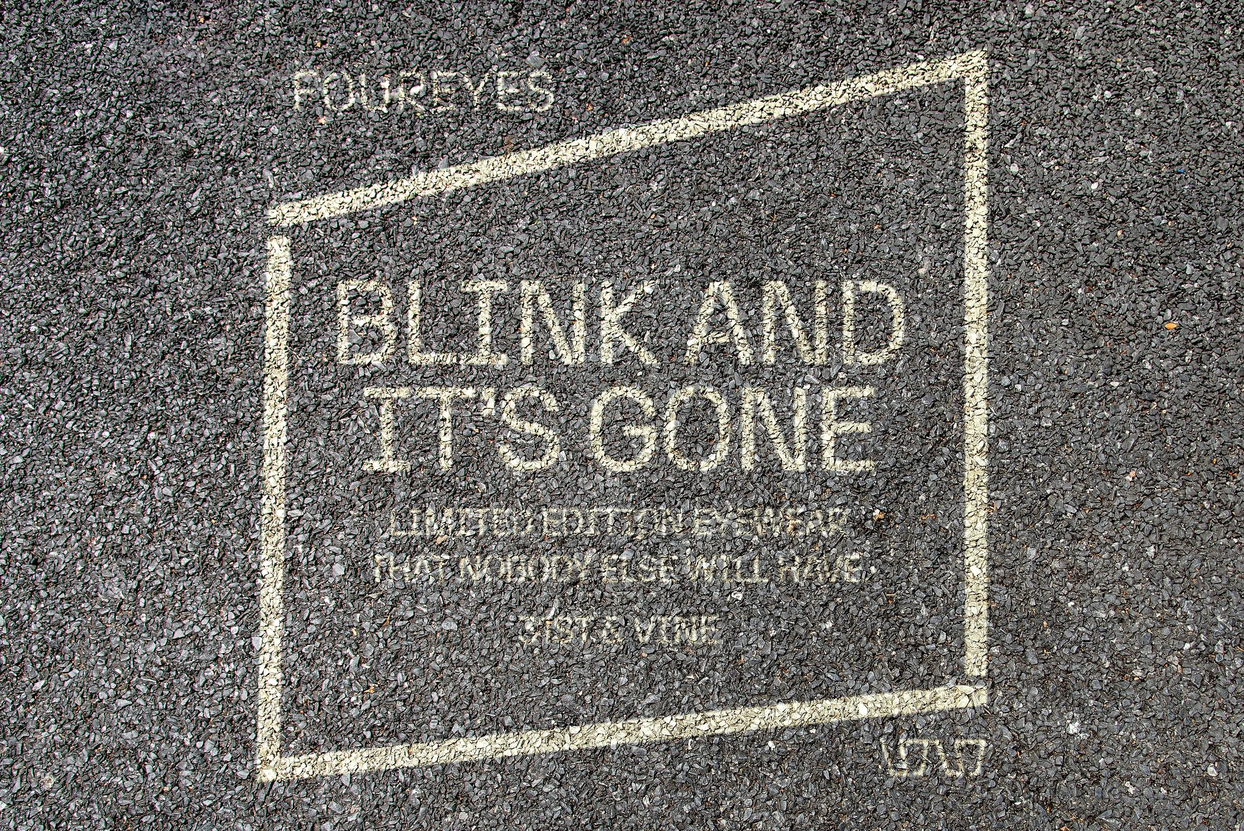
Cropped letterforms serve as the foundation of the brand’s visual identity, drawing attention to the beauty found in partial views. These fragments show up in print, packaging, and environmental design, creating a distinct system that rewards a closer look.
course
Senior Capstone
instructors
Mario F. Bocanegra Martinez
Devon Ward
Samantha Herbert
awards
Best in Show: Senior Project 2025
Jury selected by Auburn University
completed
Spring 2025
typography
N27 atipo foundry
Covik Sans OH no Type Company