-
Context
One hundred years after Ernest Hemingway penned The Sun Also Rises, this anniversary publication honors both the novel's enduring impact and the "Lost Generation" it immortalized. The project transforms Hemingway's final chapter into a limited-edition booklet that captures the essence of post-war disillusionment through contemporary design.
Challenge
Create a publication design that bridges a century of literary history while respecting strict word count limitations. The challenge was translating Hemingway's spare, iceberg theory of writing into visual form, saying more with less, just as he did with words. How do you honor both the specific narrative moment of the final chapter and the broader cultural zeitgeist of 1920s expatriate life?
Solution
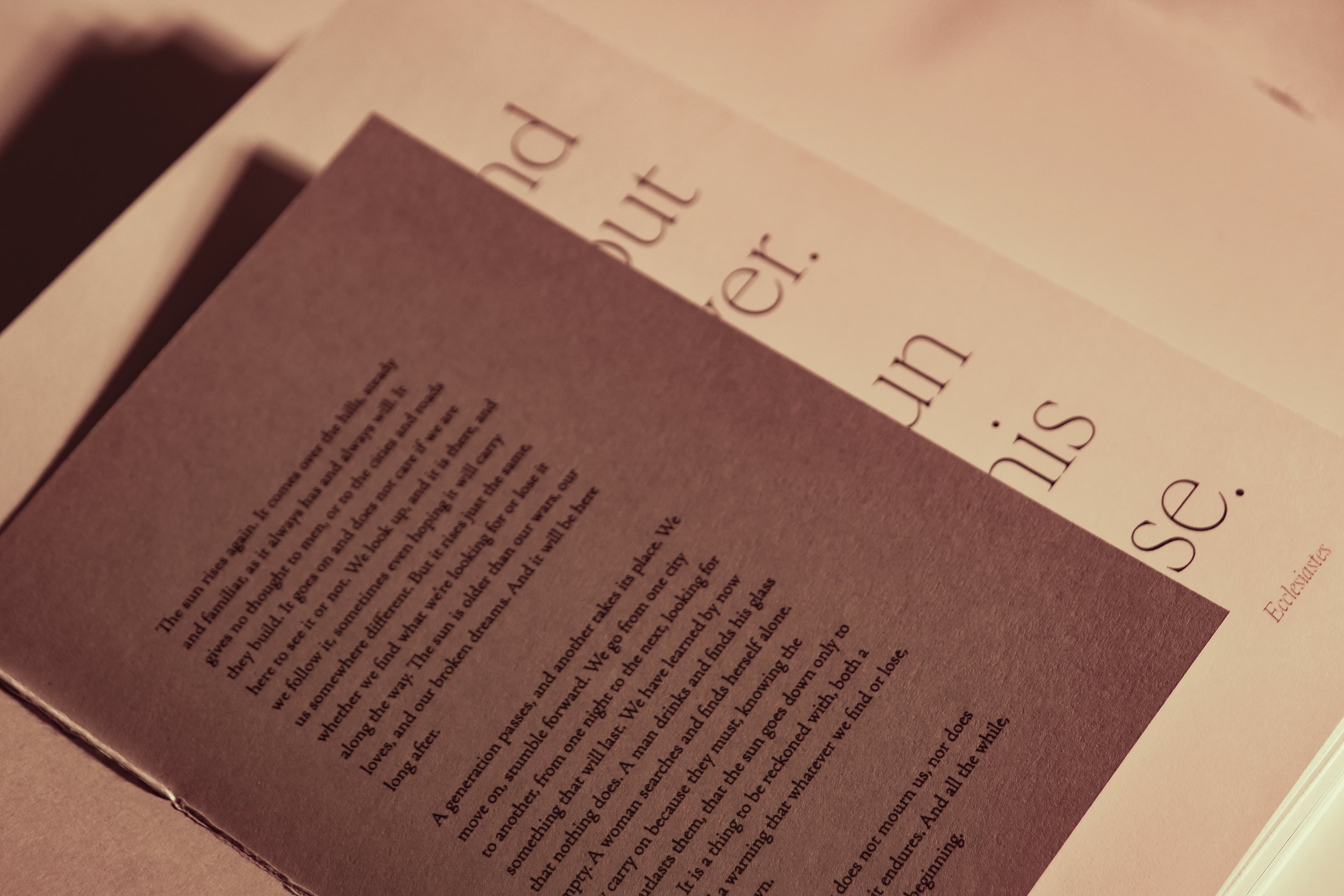
The design approach mirrors Hemingway's own aesthetic philosophy: deliberate restraint with profound emotional undercurrent. Typography selections echo the mechanical precision of 1920s typewriters and the modernist movements that shaped the Lost Generation's worldview. Layout breathing room reflects the unspoken tensions between characters, while strategic use of white space amplifies the weight of what remains unsaid.

-
Layout Design
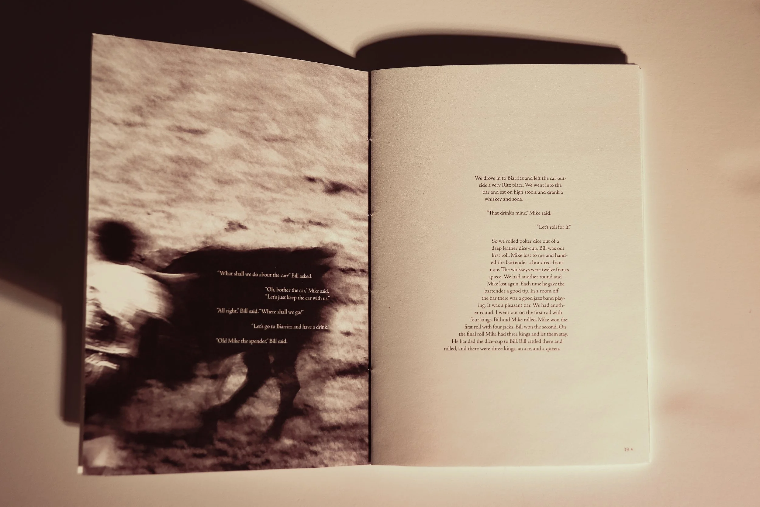
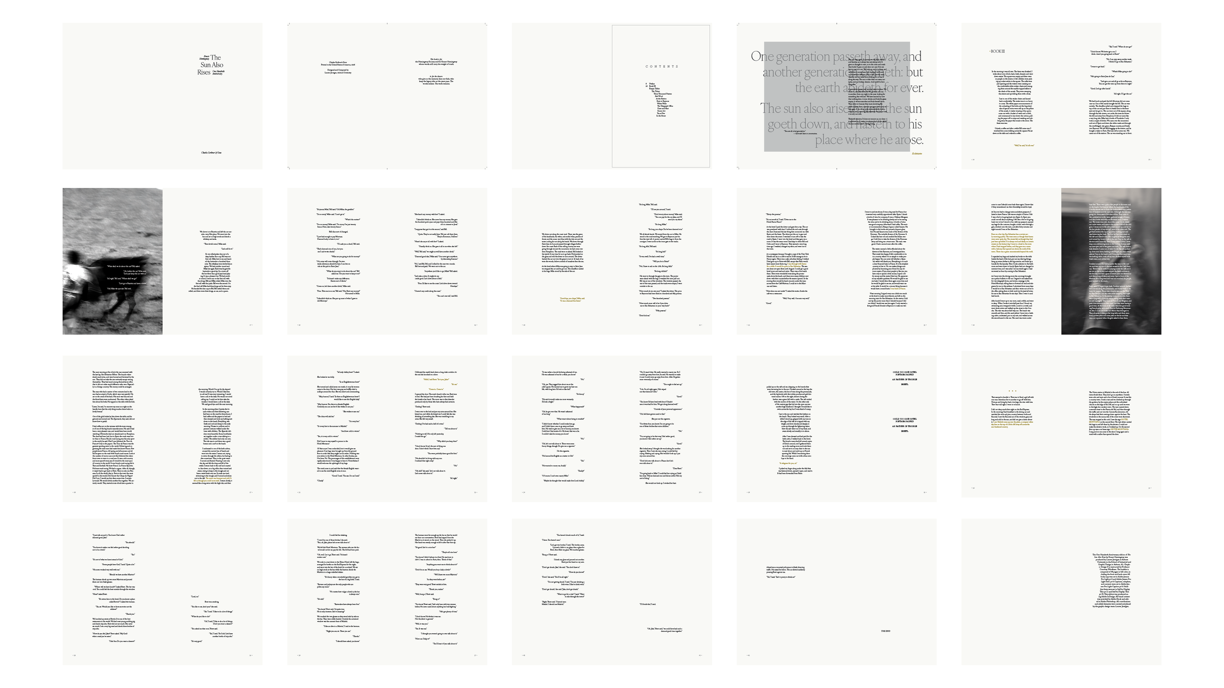
The final chapter's emotional weight demanded breathing room. Wide margins let Hemingway's sparse dialogue hang in space, just like the unspoken tension between Jake and Brett. Typography stepped back to let the words lead, with careful line spacing that mirrored the pauses in their conversation. Each page turn became a moment of anticipation, guiding readers through the story's quiet devastation.
-
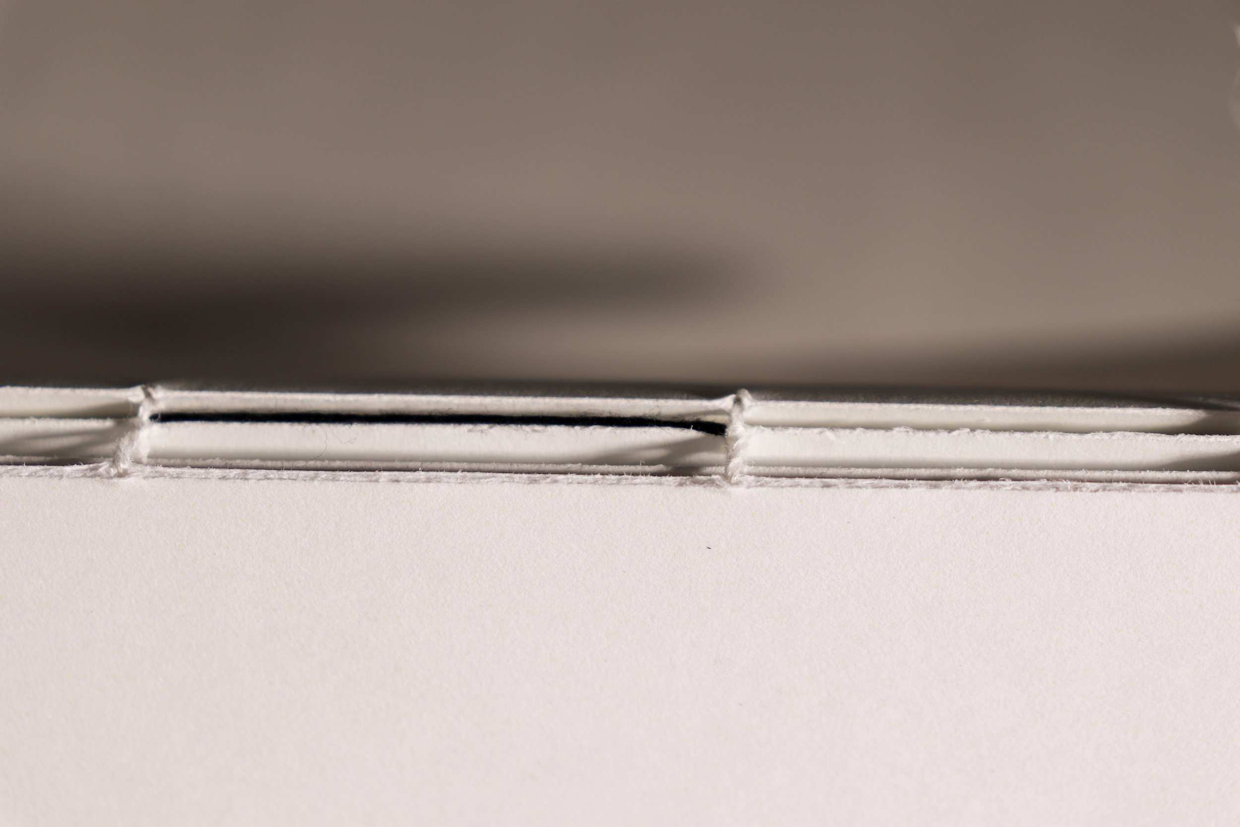
Hand-bound Construction
Coptic stitch binding honored the book's handcrafted, intimate nature. No hard cover created distance between reader and text. The exposed binding invited touch, making the reading experience tactile and personal, like handling a journal from the 1920s. This traditional technique connected the physical object to the era's artisanal culture.
-
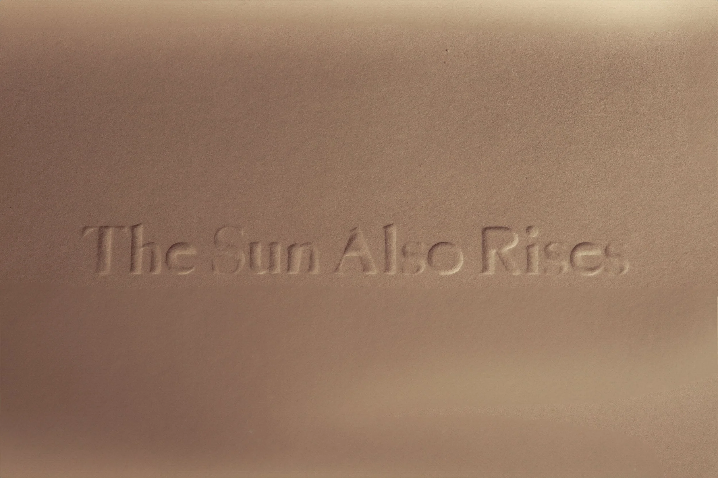
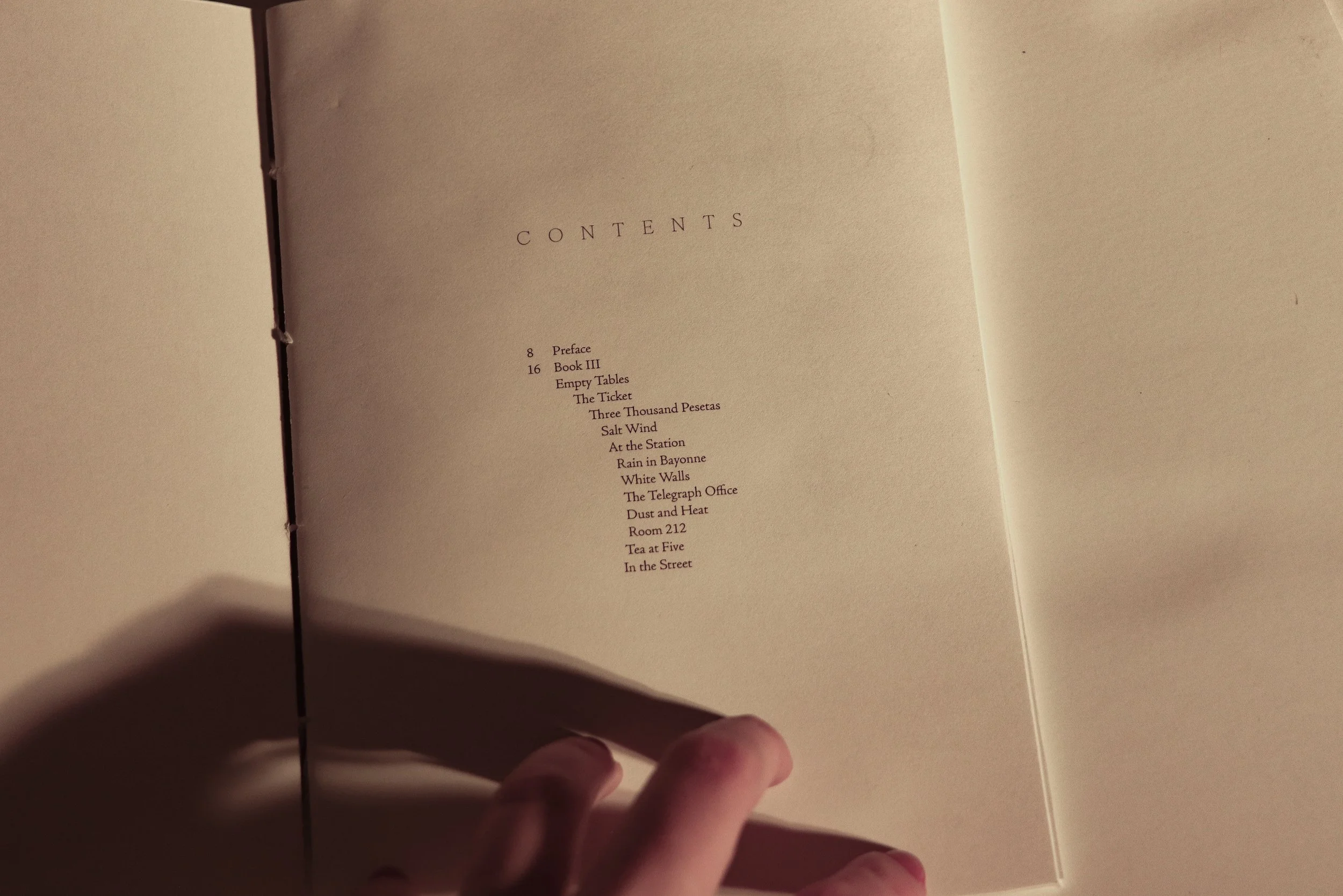
Symbolic Details
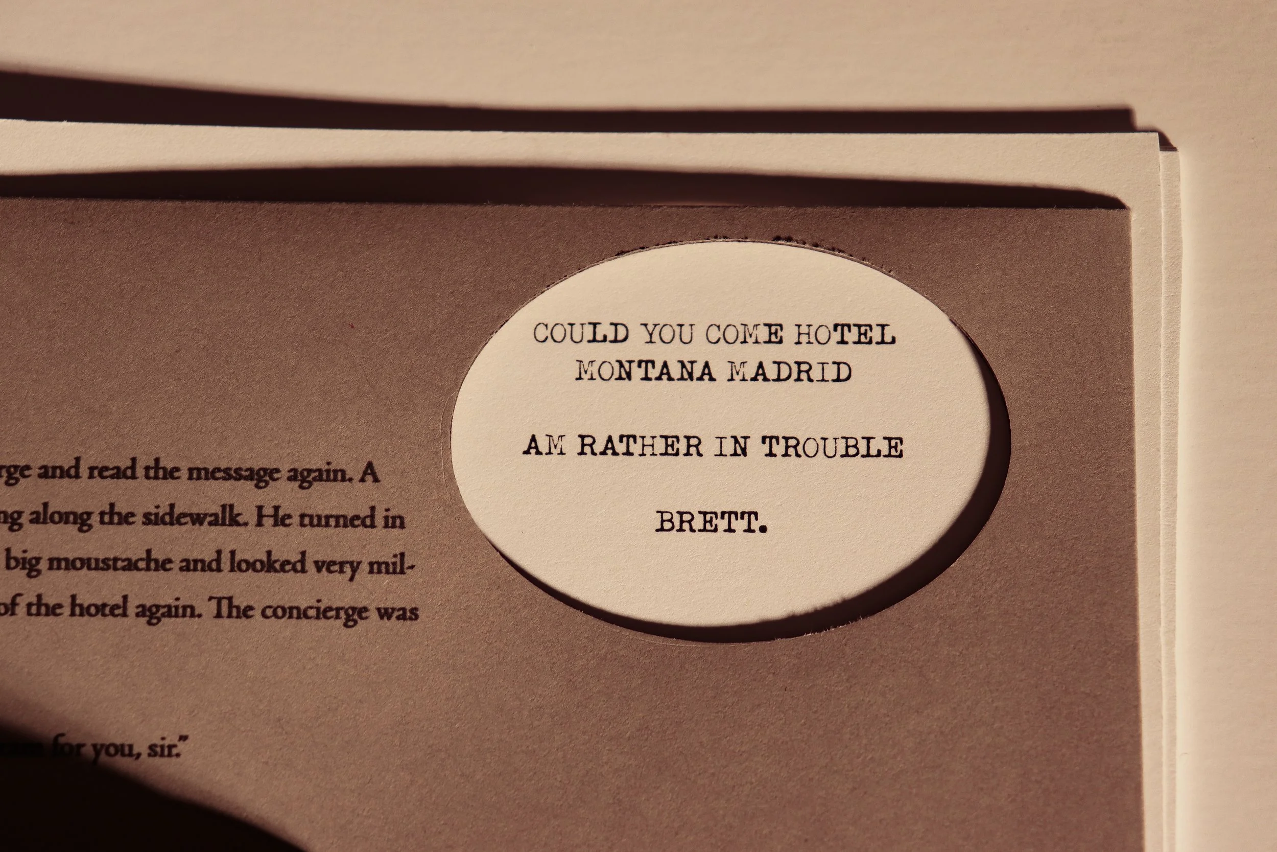
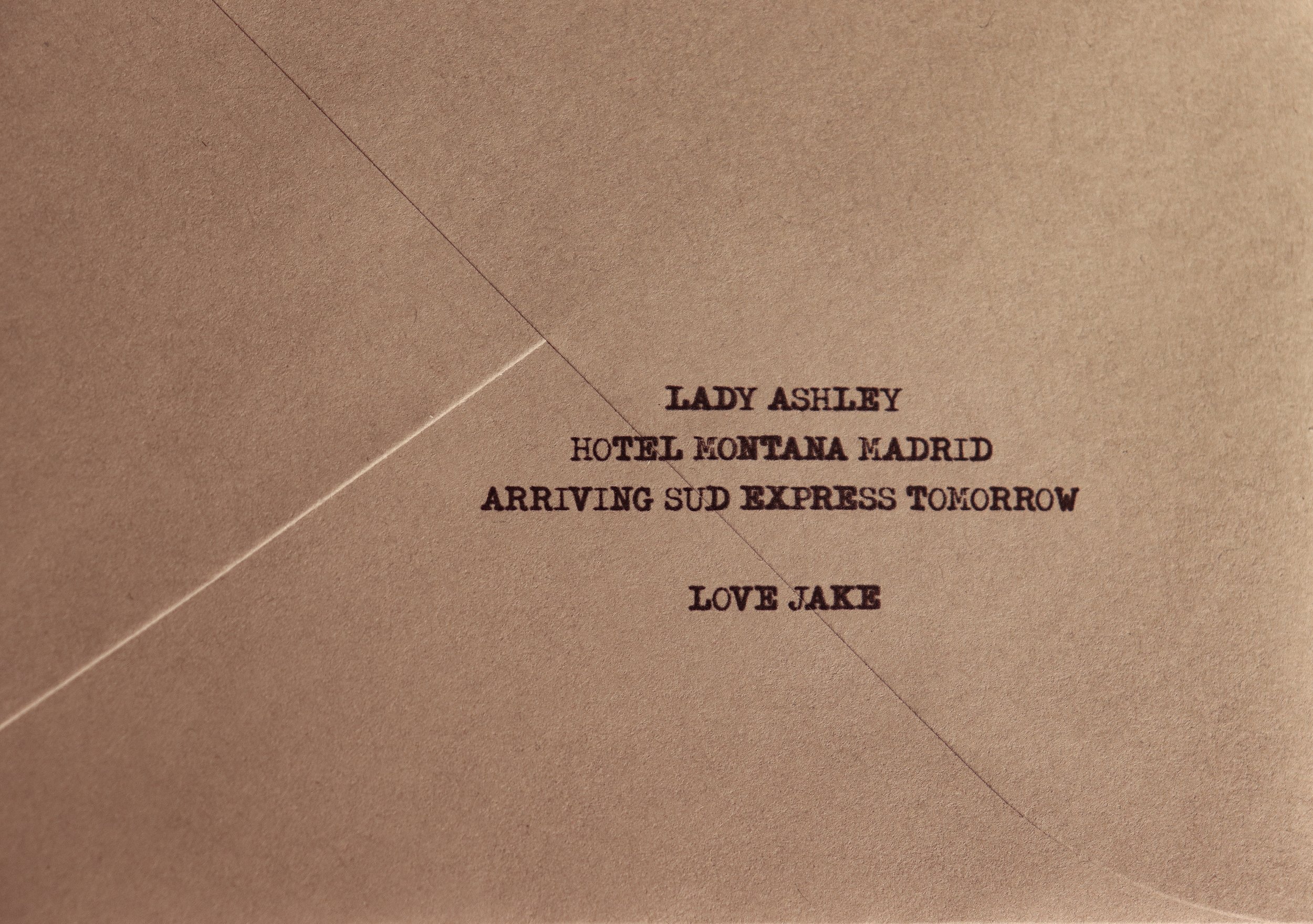
One black thread woven through the binding represented Jake's final, devastating clarity about his relationship with Brett. Embossed letterforms are quiet and half-remembered. Selective gold highlights marked pivotal story points. Gray paper used unexpectedly throughout the booklet, disrupting the rhythm. The telegram scene lived inside a gray envelope that readers interact with, making them complicit in Jake's moment of revelation.
course
Graphic Design II
instructor
Courtney Windham
completed
Fall 2024
typefaces
IVYORA Display
Adobe Jenson Pro Light
Typeka Mix